New York Jets
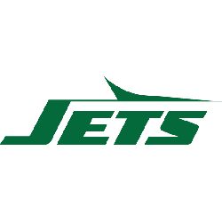
A wordmark “JETS” in gotham green italicized lettering with a green silhouette of a jet across the top. A new style of font, the shade of green, changes to the letter “E” and the shape of the jet.
Jets Primary Logo
The New York Jets have had a long and storied history since their inception in 1963. From the early days of Joe Namath’s legendary “guarantee” to the modern era, they have been an iconic part of professional football culture. Along with that have come some changes to their logo over the years, as trends and technology evolved.
In recent years however, minor tweaks were made such as adjusting font sizes or changing colors slightly but overall keeping a very close resemblance to what was originally created back in 1964; this includes adding more emphasis on green hues instead of blues while also making sure all elements remain balanced within one another so that there is still harmony present even after any modifications are done. In conclusion, despite having gone through several iterations over time, The Primary Logo remains true at heart with only slight alterations being made here & there throughout decades; illustrating how much respect the organization has for the tradition & legacy associated with the NY Jets brand!

New York Jets
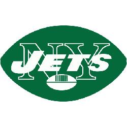
2019 - 2024
The wordmark "JETS" is in white italics, with a white and green football in front and "NEW YORK" in white above all within a green football-shaped oval.
A new shade of green.
New York Jets
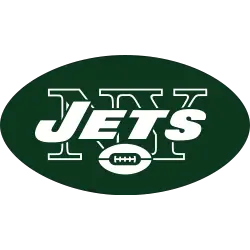
1998 - 2019
Bill Parcells in 1998, who sought to form a new team identity, changed the logo reverting to the 1965 logo, a modified version of the logo, since the oval was now more rounded at the ends and no longer resembled a football.
New York Jets
1978 - 1998
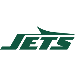
Ten years later, in 1978, the team again changed the design of the logo. The new logo, wordmark "JETS" in a "sleek, modern font" resembling the wing of a Jet.
New York Jets
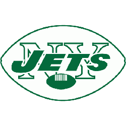
1970 - 1978
New York Jets logo from their days in the AFL is carried over to the NFL. he logo is now the shape of a green solid football with "JETS" written in white inside of the football, in the background of the logo was an outline of the letters "NY" in white. A small white football at the bottom of the logo.
New York Jets
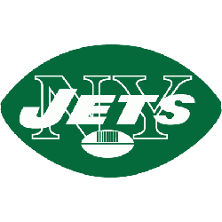
1967 - 1970
The new 1967 logo inverted the last logo from white to green. The logo is now the shape of a green solid football with "JETS" written in white inside of the football, in the background of the logo was an outline of the letters "NY" in white. A small white football at the bottom of the logo.
New York Jets
1964 - 1967
A change to the shape of a white and green outline football with "JETS" written in green inside of the football, in the background of the logo was an outline of the letters "NY." A small green football at the bottom of the logo.
New York Jets
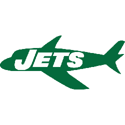
1963
In 1963, the logo changed to a green airplane with "JETS" written in white inside the shape of the plane.
The Titans of New York
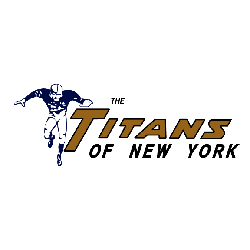
1960 - 1962
The original logo for the titans is a black and white football player next to "The Titans of New York" wordmark in navy blue and gold.
Football Sports Fan Products


All Jets Fans: Time to Cast Your Vote
Click to go to NFL Logo Battle and vote
The Evolution of New York Jets Logo History: A Detailed Analysis!
In this Video, We Unfold the journey of the iconic team's Logo History. Explore the rich tapestry of designs, uncovering the symbolism and significance behind each iteration. From inception to the present, this immersive exploration offers a deep dive into the evolution of the New York Jets logo.