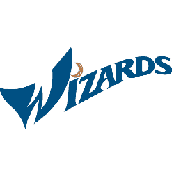
Our Washington Wizards logo wordmark collection highlights the team’s distinctive wordmark designs. From early styles to modern updates, learn about Washington Wizards logo history, explore Wizards NBA logo variations, and find new Washington Wizards logo files, preserving unique wordmarks for every Wizards fan.
Washington Wizards
2015 - Present
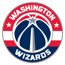
The new primary logo incorporates the “monument ball” design that has been in place since 2011 in combination with the iconic striping from the team’s uniforms, the three stars that represent D.C., Maryland and Virginia and the team’s wordmark “WASHINGTON” on top and “WIZARDS” on the bottom all in white.
Washington Wizards
2012 - Present
Wordmark WASHINGTON WIZARDS" stacked in blue italics.
Font: Friz Quadrata Bold
https://deltafonts.com/washington-wizards-2007-font/
Washington Wizards
2012 - Present
Single line wordmark "WASHINGTON WIZARDS" in blue italics.
Font: Friz Quadrata Bold
https://deltafonts.com/washington-wizards-2007-font/
Washington Wizards wordmark logos
The Washington Wizards logo history began in 1962 as the Chicago Packers, evolving through name changes and relocations. First, the wordmark featured a bold script as the Baltimore Bullets in 1968. Then, a 1997 wizard design emerged with the name change, reflecting a sleek, magical theme. Now, these wordmark logos shape the team’s identity. Visit the NBA Wizards page for team details.
Our Washington Wizards logo wordmark collection showcases the 1997 wizard design, a favorite for fans. Because it’s iconic, collectors value these wordmark logos tied to the Wizards NBA logo and potential new Washington Wizards logo ideas. For the primary design, check our Washington Wizards primary logo. Thus, this wordmark logo collection reflects the Wizards’ D.C. legacy.

