Washington Wizards
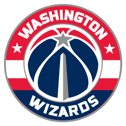
The new primary logo incorporates the “monument ball” design that has been in place since 2011 in combination with the iconic striping from the team’s uniforms, the three stars that represent D.C., Maryland and Virginia and the team’s wordmark “WASHINGTON” on top and “WIZARDS” on the bottom all in white.

Washington Wizards
2012 - 2015
In 2011, the Wizards shed the colors of old and adopted a far more pleasing nod to the Nation’s Capital with the red, white, and blue scheme. The refreshed “Wizards and moon” mark is highlighted by the new red, white, and blue color scheme, as well as a modified font and tweaks to the structure of the logo.
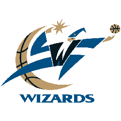
Washington Wizards
2008 - 2012
The 2008 logo is the same logo as the 1998 logo with only some slight color changes.
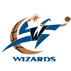
Washington Wizards
1998 - 2008
The first version of the Wizards first logo features a black "W" as the body of the wizard and his white beard. The wizard is holding a brown basketball and a gold star in the other hand. Also a crescent gold moon as a basketball. A wordmark "WIZARDS" below the logo.

Washington Bullets
1988 - 1997
The Bullets made some dramatic changes to their logo. They changed the font, changed to a lighter blue, capitalized the letter "B" and changed back to a red with white outline basketball.

Washington Bullets
1975 - 1988
The Washington Bullets went with the same logo from 1974 with some minor changes. The wordmark “Bullets” in blue with the letters “ll”‘s forming two hands grabbing for a red basketball. A wordmark ‘WASHINGTON” in blue above the letter “b.”

Capitals Bullets
1973 - 1974
The Capital Bullets use the same logo from 1970's Baltimore logo. A wordmark "Bullets" in blue with the "L"'s forming two hands grabbing for a red basketball. A wordmark 'CAPITAL" in blue.
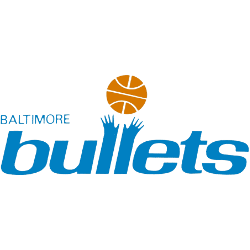
Baltimore Bullets
1971 - 1972
Wordmark “bullets” in light blue with the letters “l” forming two hands grabbing for a orange basketball. A wordmark ‘BALTIMORE” in light blue on the top and to the right of the main wordmark.
Baltimore Bullets
1970 - 1971
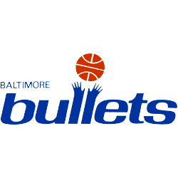
“bullets” wordmark in blue with the letters “l” forming two hands grabbing for a orange basketball. A wordmark ‘BALTIMORE” in blue on the top and to the right of the main wordmark.

Baltimore Bullets
1969 - 1970
“bullets” wordmark in light blue with the letters “l” forming two hands grabbing for a orange basketball. A wordmark ‘BALTIMORE” in light blue on the top and to the right of the main wordmark.
Baltimore Bullets
1968 - 1969
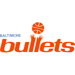
“bullets” wordmark in orange with the letters “l” forming two hands grabbing for a orange basketball. A wordmark ‘BALTIMORE” in blue on the top and to the right of the main wordmark.

Baltimore Bullets
1963 - 1968
Wordmark "Bullets" in red on a white with blue outline basketball with a bullet flying by in blue. A wordmark "BALTIMORE" on top in blue.
Chicago Zephyrs
1962 - 1963
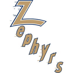
The new team called Zephyrs would feature a wordmark "Zephyrs" in gold with a white and black outline diagonally. The letters are streaking to symbolize wind.

Chicago Packers
1961 - 1962
The Packers original logo in 1962, a black outline of a bull's head on a brown basketball.
The Spark of the Washington Wizards Logo
Basketball Sports Fan Products
