Utah Jazz
A letter “J” basketball musical note with a basketball connected in blue.

Utah Jazz
2023 - 2026
A "J" note with a basketball connected to a musical note and a wordmark "UTAH JAZZ" in blue.
No more multi-colors.

Utah Jazz
2016 - 2023
The Utah Jazz unveiled their new color scheme and the classic J-note logo, revealing a familiar look that is a throwback to the team's early years in New Orleans and Salt Lake City. The team will now sport some old-school colors, including dark green and dark yellow as trim colors. Gray joins the darker blue, green, and yellow tones as an official Jazz color. The Jazz wordmark - with the iconic music note "J" and the state's name, will now be the team's primary logo.

Utah Jazz
2010 - 2016
In 2010, the logo did not change again except for the colors. The ring is dark blue, and the mountains are green and white. The wordmark "JAZZ" is now white with a yellow border. The wordmark "UTAH" is in white.

Utah Jazz
2005 - 2010
The new color scheme, which the team used until the end of the 2009 - 2010 season, consisted of navy blue, powder blue, silver and purple. The team logo remained the same, for the exception of the new color variation and removal of the streaking letter "Z."
Utah Jazz
1997 - 2005
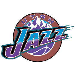
For the 1996 - 1997 season, the Jazz drastically updated their logos, with a new color scheme of purple, slightly lighter from the previous shade, copper and turquoise. A wordmark "JAZZ" in purple and blue against mountains in a copper circle with a purple basketball. The last "Z" is streaking.

Utah Jazz
1980 - 1997
In moving to Salt Lake City the Jazz kept the same logo as in New Orleans. They changed out the city name for the new state name. Added a wordmark "UTAH" in purple.
New Orleans Jazz
1975 - 1979
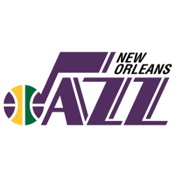
This logo consists of a multi-color basketball forming the "J" music note to write the team name "Jazz" with wordmark "New Orleans" above the name Jazz.
Utah Jazz Logo History: Shocking Evolution Revealed!
This video explores every logo transformation, revealing the stories and inspirations behind each design. Whether you're a die-hard Jazz fan or just curious about sports logos, this deep dive will give you a comprehensive understanding of the visual identity that represents Utah's beloved basketball team.
The Beat of the Utah Jazz Logo
Basketball Sports Fan Products


