
Phoenix Suns
A basketball sunburst over the stacked wordmark “PHOENIX SUNS” with a new font. The new logo features a black backdrop and a simplified basketball similar to the one used by the team from 1993 – 2000.
Phoenix Suns
2001 - 2014
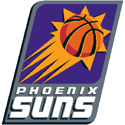
In 2001, the logo concept stayed the same with some minor changes. The shape stayed the same along with the layout. The rectangle now has two rounded corners, and the background is gray—the wordmark "PHOENIX SUNS" is white with a black trim. The orange basketball has a thicker black outline but still has the orange streaking tails with the jagged star.
Phoenix Suns
1993 - 2001
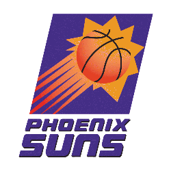
A new logo for the 1992 - 1993 campaign, with a wordmark "PHOENIX SUNS" in purple on the bottom. A orange with black outline basketball is streaking to the upper right corner with an orange jagged star and orange streaks tails in a purple square.
Phoenix Suns
1968 - 1993
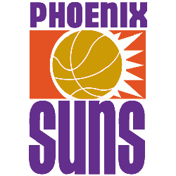
The original Phoenix Suns logo was designed by Tucsonian designer, Stan Fabe. The logo features a gold basketball with a white border that has spikes tailing to the right, this makes it look like flames. A wordmark "PHOENIX" on top and a wordmark "SUNS" on the bottom.
The Rise of the Phoenix Suns Logo
The Phoenix Suns logo history started in 1968 with a blazing sun. First, the old Phoenix Suns logo used orange and purple. Then, it got sleeker because fans loved bold vibes. Now, it’s a sharp design. Visit the NBA Suns page for team details. The Phoenix Suns logo shines bright.
Basketball Sports Fan Products


Suns Enthusiasts: Time to Exercise Your Vote
Click to go to NBA Logo Battle and vote


