Our Philadelphia Warriors logo collection showcases alternate logos from the team’s early Pennsylvania legacy. From bold designs to classic emblems, learn about Philadelphia Warriors logo history, explore Philadelphia Warriors original logo styles, and find Philly Warriors logo options, preserving unique logos for every fan.
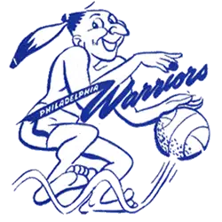
Philadelphia Warriors
1952 - 1962
A new design of the native american dribbling a basketball with blue wordmark "PHILADELPHIA" in blue on a banner off the "W" and a scripted wordmark "Warriors" in blue.
Philadelphia Warriors
1952 - 1962
A red and yellow warrior in bare feet and wearing a red and yellow feather dribbling a brown basketball, all with a blue outline.

Philadelphia Warriors Basketball Alternate Logos
The Philadelphia Warriors logo history began in 1946 as a BAA founding team. First, an alternate Philadelphia Warriors logo featured a red basketball with a warrior silhouette. Then, a 1952 blue “Warriors” script emerged because fans loved its simple charm. Now, these alternate logos are historic gems. Visit the NBA Warriors page for team details.
Our alternate Philadelphia Warriors logo collection highlights the 1952 blue script, a favorite for fans seeking Philly Warriors logo files in PNG format. Because they’re unique, collectors value these alternate logos for gear inspired by Philadelphia Warriors original logo designs. For the primary design, check our Philadelphia Warriors primary logo. Thus, this alternate logo collection reflects the Warriors’ early glory before moving to San Francisco.

