
Orlando Magic
A basketball in blue with white highlights and several stars in white with blue and black trim trailing behind it.

Orlando Magic
2011 - 2025
In 2011, the new logo incorporates the Magic's wordmark "MAGIC" in blue with a white and black border giving a more integrated look. The updated look includes the team's current logo with the iconic star ball carried over from the previous logo. On top is a wordmark "ORLANDO" in black.
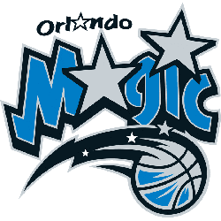
Orlando Magic
2001 - 2011
Prior to the 2000 - 2001 season the Magic redesigned their logo, a different starry basketball was used. The silver and blue basketball in black trim with a black tail and three small stars in white and silver. The basketball is placed under the "Magic" wordmark in blue with black trim with two silver stars representing the letter "A" and the dot in the "i." In addition, a wordmark "Orlando" with a white star representing the letter "A" is used.
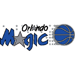
Orlando Magic
1990 - 2001
The Orlando Magics first logo featured the wordmark "Magic" in blue with a silver star that represents the letter"A," and a blue with silver trim basketball with several shooting stars trailing. In addition a wordmark "Orlando" in black with a silver star that represents the letter "A."
The Story of the Orlando Magic Logo
The Orlando Magic logo history kicked off in 1989 with a starry basketball. First, the old Orlando Magic logo used bold blue and black. Then, it got sharper because fans loved the magical vibe. Now, it shines bright. Visit the NBA Magic page for team details. The Orlando Magic logo reflects Orlando’s flair.
Basketball Sports Fan Products


Magic Enthusiasts: Time to Exercise Your Vote
Click to go to NBA Logo Battle and vote


