Our New York Nets logo wordmark collection highlights the team’s distinctive wordmark designs from its New York era. From its origins to its NBA tenure, learn about New York Nets logo history, explore New York Nets NBA ties, and find New York Nets basketball wordmark files, preserving unique designs for fans.
New York Nets
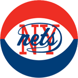
1973 - 1977
In 1972, the Nets opted to continue the previous logo with a red, white and blue basketball, much like the one the ABA used during games. They did retain the previous main logo, blue wordmark "nets" against a red block "NY."

New York Nets
1972 - 1977
A double-line wordmark for the Nets. On top in blue "NEW YORK" and on the bottom in a bold read "NETS."
Font: Custom
New York Nets wordmark logos
The New York Nets logo history began in 1968 after moving from New Jersey as the Americans. First, the wordmark featured a bold “Nets” script with a basketball. Then, a 1972 stylized design emerged because fans liked its dynamic style. These wordmark logos defined the team until 1976. Visit the NBA Nets page for team details.
Our New York Nets logo wordmark collection showcases the 1972 stylized design, a favorite for fans of New York Nets basketball and New York Nets NBA heritage. Because it’s historic, collectors value these wordmark logos from the team’s New York years. For the primary design, check our New York Nets primary logo. Thus, this wordmark logo collection reflects the Nets’ New York legacy.
Basketball Sports Fan Products