Los Angeles Lakers
A gold with purple outline basketball with a wordmark “LAKERS” across the front in purple with speed lines on a white formed background. A darkened shade of purple.

Los Angeles Lakers
2018 - 2024
A gold with black outline basketball with a speed lines wordmark "LAKERS" and "LOS ANGELES" across the front in purple.
Darkened the shade of purple.
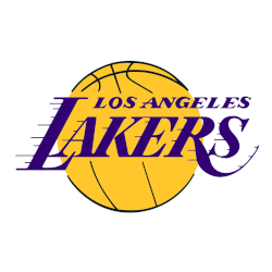
Los Angeles Lakers
2000 - 2018
A speed lines wordmark "LAKERS" in purple across a gold with black outline basketball and "LOS ANGELES" above on a white formed background.
Darkened their shade of purple.
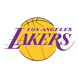
Los Angeles Lakers
1976 - 2000
A gold with black outline basketball and a speed lines wordmark "LAKERS" across the front with "LOS ANGELES" in forum purple on a white formed background.
Adjustments to the speed lines and the shade of purple.
Los Angeles Lakers
1972 - 1976
A speed lines wordmark "LAKERS" and "LOS ANGELES" remained across the front of a now gold basketball in forum purple and gold.
The colors were lightened.
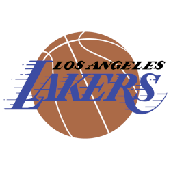
Los Angeles Lakers
1966 - 1972
A brown with white outline basketball behind the speed lines wordmark "LAKERS" in forum blue and "LOS ANGELES" above in black on a white formed background.
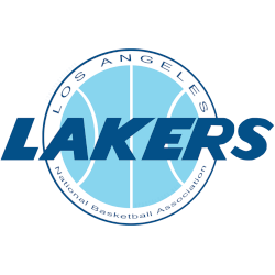
Los Angeles Lakers
1961 - 1966
A wordmark "LAKERS" in blue across a light blue basketball with "LOS ANGELES" arched above and "NATIONAL BASKETBALL ASSOCIATION" below in blue.

Minneapolis Lakers
1948 - 1960
The first logo of the Lakers was back when the team was in Minneapolis. The logo has a map of Minnesota in white on a brown and black outline basketball as a background and the location of Minneapolis is highlighted by a yellow star. A wordmark "MPLS" in yellow with two stars and "LAKERS" below in yellow.
Evolution of the Los Angeles Lakers Logo
The Los Angeles Lakers logo history began in 1947 with a simple basketball. First, Minneapolis logos used blue and white. Then, purple and gold defined the Los Angeles Lakers logo. Visit the NBA Lakers page for team details. Now, it’s a timeless classic.
Basketball Sports Fan Products


Lakers Enthusiasts: Time to Exercise Your Vote
Click to go to NBA Logo Battle and vote


