Detroit Pistons
In 2017 the Pistons return to the 80’s and 90’s logo. Pistons changed the basketball to a solid red with white outline. The wordmark “DETROIT PISTONS” in white and in the center of the basketball. The red basketball is enclosed with a blue ring. The logo modifies the text-over-red-basketball scheme the team has used for the last 12 seasons, reducing the font size significantly and altering the look of the ball. It closely resembles the team’s logo from 1979–1996, which notably includes the Bad Boys era. “The bold red, white and blue color scheme and basketball icon have withstood the test of time through the evolution of the franchise and the city,” the team said. “And now that a new chapter is being written, that evolution continues with a new identity built on the Pistons championship tradition and promising future.” Detroit’s 2005-2017 logo was starting to look a bit outdated, and the cleaner retro look is a big upgrade. The chrome outline on the new logo pays tribute to Detroit muscle cars, the team said.
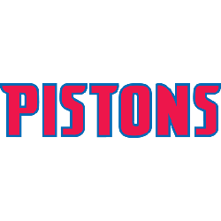
Pistons Wordmark Logo
The Detroit Pistons have had a long and storied history in the National Basketball Association, dating back to their founding in 1948. The team has gone through several logo changes over the years, but one thing that has remained constant is their iconic wordmark logo. This distinctive design first appeared on the uniforms of players during the 1970s and continues to be used today as an integral part of their visual identity.
The original version of this logo featured bold black lettering with red outlines around each letter spelling out "PISTONS". It was designed by legendary graphic designer Lance Wyman who also created logos for other teams such as Major League Baseball's Oakland Athletics and NFL's Washington Redskins. Over time, minor tweaks were made including changing from block letters to script typeface and adding a blue shadow effect behind each letter which gave it more depth when viewed from afar or up close.
Today, this classic design still remains largely unchanged since its introduction nearly half a century ago with only small modifications being made here or there throughout its lifespan such as switching out colors (from red/black/blue color scheme) or removing elements like stars that once accompanied it on some versions of jerseys worn by players during certain seasons. Despite all these alterations though, the core essence remains intact - making it easily recognizable even after all these years. As we move into another era for basketball fans everywhere, it’s clear that no matter what happens next, this timeless symbol will always represent Detroit Pistons' proud legacy within NBA circles worldwide.
Detroit Pistons
2002 - Present
Wordmark "PISTONS" in red with a blue outline.
Zurich Bold Extra Condensed
https://deltafonts.com/detroit-pistons-1979-font/
Detroit Pistons
2002 - Present
Wordmark "PISTONS" in red with a blue outline in a arched formation.
Zurich Bold Extra Condensed
https://deltafonts.com/detroit-pistons-1979-font/