
Detroit Pistons
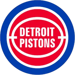
In 2017 the Pistons return to the 80’s and 90’s logo. Pistons changed the basketball to a solid red with white outline. The wordmark “DETROIT PISTONS” in white and in the center of the basketball. The red basketball is enclosed with a blue ring. The logo modifies the text-over-red-basketball scheme the team has used for the last 12 seasons, reducing the font size significantly and altering the look of the ball. It closely resembles the team’s logo from 1979–1996, which notably includes the Bad Boys era. “The bold red, white and blue color scheme and basketball icon have withstood the test of time through the evolution of the franchise and the city,” the team said. “And now that a new chapter is being written, that evolution continues with a new identity built on the Pistons championship tradition and promising future.” Detroit’s 2005-2017 logo was starting to look a bit outdated, and the cleaner retro look is a big upgrade. The chrome outline on the new logo pays tribute to Detroit muscle cars, the team said.
Detroit Pistons
2006 - 2017
The current logo consists of a red basketball and a tie in the colors of America. The current configuration of the red ball with the blue-and-white accents and the customized font with that has “DETROIT” a bit more understated than “PISTONS” inside the ball.
Detroit Pistons
2002 - 2006
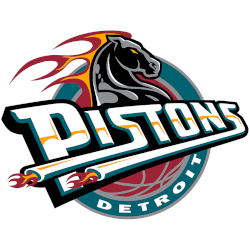
In 2002 the logo stayed the same with only color changes. The colors blue, red, and navy blue now dominate the logo.
Detroit Pistons
1997 - 2002
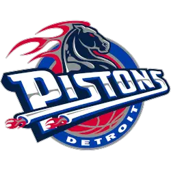
In keeping up with the latest fashion trends, the Pistons changed their team colors to teal, black, yellow, and red during the summer of 1996. The new logo features a horse's head and flaming mane, representing "horsepower," holding consistent with Detroit's automotive theme. A wordmark "PISTONS" in white with black and teal trim and "DETROIT" in white at the bottom.
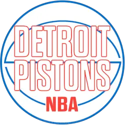
Detroit Pistons
1979 - 1997
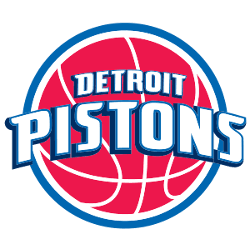
The following design of the basketball logo for the Pistons changed the basketball to a solid red with a white outline—the wordmark "DETROIT PISTONS" in white and in the center of the basketball. The red basketball is enclosed with a blue ring.
Detroit Pistons
1976 - 1979
The Pistons altered the basketball logo from 1976, the outline of the basketball is now a thicker blue outline and font or lettering is solid red. The wordmark "DETROIT PISTONS" and "NBA" below in red.
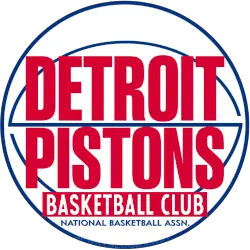
Detroit Pistons
1969 - 1976
A wordmark "DETROIT PISTONS" in red lettering with a red rectangle below containing "BASKETBALL CLUB and NATIONAL BASKETBALL ASSN." in white, all placed upon a blue and white basketball.
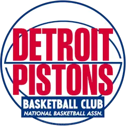
Detroit Pistons
1958 - 1969
A wordmark "DETROIT PISTONS" in red lettering with a blue rectable below containing "BASKETBALL CLUB and NATIONAL BASKETBALL ASSN." in white, all placed upon a blue and white basketball.
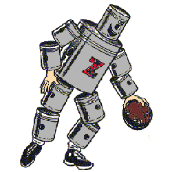
Ft. Wayne Pistons
1948 - 1957
A new redesign of the animated piston basketball player dribbling a brown basketball. The grey basketball player has "Z" on his chest in red.
Ft. Wayne Zollner Pistons
1941 - 1947
The Piston's first logo was an animated character running and going up for a layup, built entirely from the automotive components or pistons all in the color red.
Detroit Pistons Logo Through the Years: Legends, Championships & Iconic Moments
What do horsepower, basketballs, and fonts straight out of your middle school PowerPoint have in common? 💥 The Detroit Pistons logo history, that’s what!
Detroit Pistons Primary Logo Timeline
The early Detroit Pistons logo history reflects a rugged, mechanical theme, echoing the team's Motor City roots. One classic version even featured a basketball with exhaust pipes. Each redesign added something fresh while honoring tradition. You can also view the Pistons Alternate logo history.
In recent years, the Detroit Pistons logo redesign brought back a clean, retro-style roundel with bold colors and modern detailing. It pays tribute to earlier designs while aligning with today’s NBA aesthetics. Learn more about the team and their evolving identity from the official NBA source.
Basketball Sports Fan Products


Pistons Enthusiasts: Time to Exercise Your Vote
Click to go to NBA Logo Battle and vote


