Our Denver Rockets logo collection showcases alternate logos from the team’s early Colorado days. From bold designs to historic emblems, learn about Denver Rockets history, explore Denver Rockets basketball moments, and find Denver Nuggets logo history ties, preserving unique logos for every fan.

Denver Rockets
1972 - 1973
The final logo for the Rockets was a yellow and purple rocket dribbling a basketball over rocky mountains with a purple circle and a wordmark "DENVER ROCKETS" in purple.
Denver Rockets
1972 - 1974
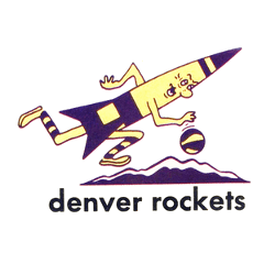
A yellow and purple rocket dribbling a basketball over rocky mountains and a wordmark "DENVER ROCKETS" below in black.
Denver Rockets
1968 - 1971
A black with red trim rocket.

The Origin of Denver Rockets Alternate Logos
The Denver Rockets history started in 1967 as an ABA team. First, an alternate Denver Rockets logo featured an orange basketball with “Rockets” in red. Then, a 1971 purple rocket design emerged because fans loved its playful vibe. Now, these alternate logos are classic relics. Visit the NBA Nuggets page for team details.
Our alternate Denver Rockets logo collection highlights the 1971 purple rocket, a favorite for Denver Rockets basketball fans. Because they’re unique, collectors value these alternate logos for gear linked to Denver Nuggets logo history. For the primary design, check our Denver Rockets primary logo. Thus, this alternate logo collection reflects the team’s ABA roots before becoming the Nuggets.

