
Denver Nuggets
Gold pickaxes with a white and gold mountain peak between them, a white and gold basketball below inside a navy blue and red with gold trim roundel. Wordmark “DENVER NUGGETS” in white encircling the logo separated by two odd shaped gold stars.
Nuggets Wordmark Logo
In 1994, this design was updated to make it more modern looking. The colors were changed to navy blue and gold, while two mountains were added for an emphasis around each letter of "Nuggets". This new look remained until 2003 when yet another update occurred; this time adding silver accents on either side of each letter as well as outlining them all together for even greater visibility.
Finally, in 2012, we saw what has become known today as their current wordmark logo: A bold black font featuring white outlines that give off an edgy vibe that perfectly encapsulates their brand identity today - one built upon tenacity and resilience both on & off the court! With such a rich history behind them now immortalized into their iconic visual identity – there’s no doubt that these Nuggets will continue making waves throughout NBA circles for years to come!

Denver Nuggets
2019 - Present
Double lined wordmark "DENVER" on top and "NUGGETS" in a larger font on the bottom all in blue.
Font: Aachen Bold
https://famfonts.com/denver-nuggets
Denver Nuggets
2003 - 2018
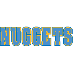
Wordmark "NUGGETS" in light blue outlined in yellow, worn on the Denver Nuggets home jersey.
Font: Aachen Bold
https://famfonts.com/denver-nuggets

Denver Nuggets
2003 - 2018
Single line wordmark "DENVER NUGGETS" written in powder blue.
Font: Aachen Bold
https://famfonts.com/denver-nuggets

Basketball Sports Fan Products


Denver Nuggets Logo History Revealed: From Past to Present!
This video delves deep into the intriguing realm of Denver Nuggets Logo History. From its humble beginnings to the striking designs of today, join us on a journey through time as we uncover the secrets and evolution behind the Denver Nuggets logo. Stay tuned for insights and revelations!