Denver Nuggets
Gold pickaxes with a white and gold mountain peak between them, a white and gold basketball below inside a navy blue and red with gold trim roundel. Wordmark “DENVER NUGGETS” in white encircling the logo separated by two odd shaped gold stars.
Denver Nuggets
2009 - 2019
A darker blue snow-capped mountain peak over the “Nuggets” wordmark in yellow with a light blue trim. This logo has evolved for the 2009 season with the reintroduction of navy blue to the previous color scheme.
Denver Nuggets
2004 - 2009
In 2003, the team switched to a new color scheme of light blue and bright gold, ditching the darker navy and gold. The logo stayed the same from 1994.
Denver Nuggets
1994 - 2004
In 1993, the team decided to do a complete overhaul of the rainbow look and completely redesigned the team logo. The new logo featured a dark blue snow capped mountain peak over a gold arched "Nuggets" wordmark. An additional wordmark "DENVER" in white above the team name. The entire logo has a red trim.
Denver Nuggets
1982 - 1994
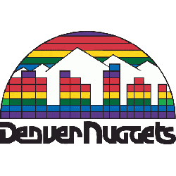
For the 1981 - 1982 the team decided to do a multi-color mosaic looking logo. The Nuggets black colored font made the transition to the new logo that featured the Denver skyline in a rainbow blocked colored design.
Denver Nuggets
1976 - 1982
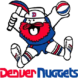
The Nuggets first logo was "Maxie the Miner". The red, blue and white miner was a "Yukon Cornelius" looking prospector who was giddy, leaping in the air, holding a ABA basketball and a prospecting pick axe. A wordmark "Denver" in red and "Nuggets" in blue with a unique font.

Denver Nuggets
1974 - 1976
The Nuggets first logo was "Maxie the Miner". The red, blue and white miner was a "Yukon Cornelius" looking prospector who was giddy, leaping in the air, holding a ABA basketball and a prospecting pick axe. A wordmark "Denver Nuggets" arched around the miner in blue with a unique font.

Denver Rockets
1972 - 1973
The final logo for the Rockets was a yellow and purple rocket dribbling a basketball over rocky mountains with a purple circle and a wordmark "DENVER ROCKETS" in purple.
Denver Rockets
1968 - 1972
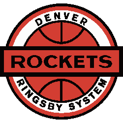
This custom design of owner Bill Ringsby trucking company logo, used as the original Denver Rockets logo with a wordmark "ROCKETS" written across a orange basketball surrounded by a ring. In addition, a wordmark "DENVER" on top and "RINGSBY SYSTEM" on the bottom in black on a white background.
Denver Nuggets Logo History Revealed: From Past to Present!
This video delves deep into the intriguing realm of Denver Nuggets Logo History. From its humble beginnings to the striking designs of today, join us on a journey through time as we uncover the secrets and evolution behind the Denver Nuggets logo. Stay tuned for insights and revelations!
Timeline of Denver Nuggets Logo Changes
The original Denver Nuggets primary logo introduced a mountain theme, symbolizing Colorado’s rugged landscape. Over the years, it transformed to reflect different branding approaches. The bold colors and shapes became more polished in recent versions. You can also view a Denver Nuggets logo PNG on our NBA logos archive.
Earlier versions, especially the retro Denver Nuggets logo, showcased a more playful aesthetic with rainbow elements. These logos remain fan favorites and are often seen on throwback merchandise. Learn more about how the Denver Nuggets logo history connects to team culture on the official NBA site.
Basketball Sports Fan Products


Nuggets Enthusiasts: Time to Exercise Your Vote
Click to go to NBA Logo Battle and vote


