Our Dallas Mavericks logo wordmark collection highlights the team’s standout wordmark designs. From early styles to recent updates, learn about Dallas Mavericks logo history, explore old Dallas Mavericks logo variations, and find new Dallas Mavericks logo designs, preserving unique wordmarks for every Mavericks fan.

Dallas Mavericks
2018 - Present
Incorporating a shield with a the head of a stallion, the stallion’s mane sweeps inside a circle giving the appearance of the seam lines found on a basketball. In addition, a wordmark of “Mavericks” at the bottom above a star and a wordmark “DALLAS” in black above the stallion. New shades of blue and silver in this new logo version.
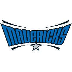
Dallas Mavericks
2002 - Present
Wordmark "MAVERICKS" in blue and black background. A silver star with black outline below the wordmark and centered. Also, black swooshes on top and bottom of the wordmark.
Font: TF Cavalier Upright Bold
https://deltafonts.com/dallas-mavericks-font/
The Development of Dallas Mavericks Wordmark Logos
The Dallas Mavericks logo history started in 1980 with a bold wordmark featuring “DALLAS MAVERICKS” in blue. First, it used a serif font with a cowboy hat accent. Then, a 2001 sleek script emerged because fans liked its modern edge. Now, these wordmark logos shape the team’s identity. Visit the NBA Mavericks page for team details.
Our Dallas Mavericks logo wordmark collection showcases the 2001 sleek script, a favorite for fans. Because it’s iconic, collectors value these wordmark logos tied to the old Dallas Mavericks logo and new Dallas Mavericks logo styles. For the primary design, check our Dallas Mavericks primary logo. Thus, this wordmark logo collection reflects the Mavericks’ Texas legacy.