Dallas Mavericks
Incorporating a shield with a the head of a stallion, the stallion’s mane sweeps inside a circle giving the appearance of the seam lines found on a basketball. In addition, a wordmark of “Mavericks” at the bottom above a star and a wordmark “DALLAS” in black above the stallion. New shades of blue and silver in this new logo version.
Dallas Mavericks
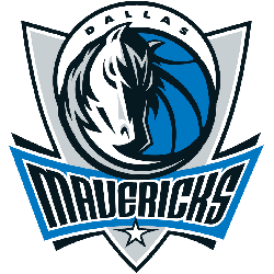
2002 - 2018
Beginning with the 2001 – 2002 season, the team adopted a bold new logo that maintained a Western theme and a color change. Incorporating a shield with the head of a stallion, the stallion’s mane sweeps inside a circle, giving the appearance of the seam lines found on a basketball. In addition, a wordmark of “Mavericks” at the bottom above a star and a wordmark “DALLAS” in black above the stallion.
Dallas Mavericks
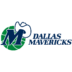
1994 - 2002
In 1994 the Mavericks made the original logo smaller in size and removed the green and white outline from the wordmark "DALLAS MAVERICKS," now in blue. The white cowboy hat on a blue "M" with a green basketball background is the same. The letter "M" stands for Mavericks.
Dallas Mavericks
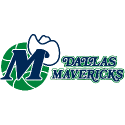
1981 - 1994
The first Dallas logo is a blue "M" wearing a white cowboy hat on a green basketball, a wordmark "DALLAS MAVERICKS" to the right in blue, white, and green. The letter "M" stands for Mavericks.
Changes in the Dallas Mavericks Logo Over Time
The Dallas Mavericks logo history shows a strong shift from playful to powerful branding. The earlier logo with a green cowboy hat carried a retro charm, while the new Dallas Mavericks logo uses sharper lines and modern tones to reflect today’s competitive edge. Take a look at the full evolution across all NBA logos to see how other franchises have rebranded.
You can also visit the official Mavericks website to see how the team presents the new Dallas Mavericks logo across merchandise, uniforms, and digital platforms.
Basketball Sports Fan Products


