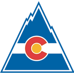
The Colorado Rockies logo leads the team’s primary logo collection, shining in the NHL from 1976 to 1982. Its bold mountain design reflects Colorado’s rugged terrain. Consequently, the Colorado Rockies hockey team’s emblem captivates fans, showcasing the Colorado Rockies logo’s historical depth and regional pride.

Colorado Rockies
1977 - 1982
The Scouts became the Rockies, named after the mountainous region. The logo consists of the Colorado state flag drawn into the shape of a blue mountain with a red "C" and a yellow dot in the middle.

Colorado Rockies
1977 - 1982
The Scouts became the Rockies, named after the mountainous region. The logo consists of the Colorado state flag drawn into the shape of a blue mountain with a red "C" and a yellow dot in the middle.
Rugged Colorado Rockies Logo
The Colorado Rockies logo, a red and blue mountain peak with a puck, anchors the primary logo collection. Launched in 1976 for the Colorado Rockies hockey team’s NHL debut, it mirrors the state’s geography. Collectors value its bold appeal. Additionally, see the Colorado Rockies Alternate Logo.
The Colorado Rockies logo energized fans at games, tied to the 1976-1982 NHL era before the team became the New Jersey Devils. Its colors echo Colorado Rockies NHL logo designs on jerseys, linking to Denver’s legacy. Furthermore, its impact lives on, as noted on the team’s Wikipedia page.
"From the Original Six to the Modern Era"
Every jersey tells a story of championships won and rivalries forged on the ice. Honor the heritage of your franchise and gear up with authentic threads that celebrate decades of hockey history.
Shop the Official NHL Collection
