Columbus Blue Jackets
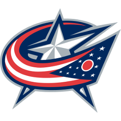
The red, white and blue flag is wrapping around the white and silver star in the background is the Ohio state flag, which is fitting for the only NHL team based in the state. And the way the flag swooshes around the star makes a subtle “C” in the logo to stand for Columbus.
Blue Jackets Primary Logo
The Columbus Blue Jackets' primary logo is a timeless symbol of the city and its hockey team. The original logo was designed in 2000 when the franchise first joined the National Hockey League as an expansion team. It featured a white star with three stripes on each side, representing Ohio’s state flag and a unique font for ‘Blue Jackets’ that has become iconic over time.
In 2010, the organization decided to update its look by introducing new uniforms and logos, which included slight modifications to its primary logo, most notably adding navy blue accents. This gave it more depth while still keeping true to its original design intent – honoring Ohio's history through sport.
Today, this updated version of Columbus' classic mark continues to be used throughout all aspects of branding for both home games at Nationwide Arena or away games across North America; from merchandise sold online or in-store locations around town - showing fans everywhere just how proud they are about being part of this great tradition!

Columbus Blue Jackets
2004 - 2008
The original logo had a red ribbon with 13 stars representing the 13 Colonies, unfurled in the shape of the team’s initials, CBJ, with an electric gold hockey stick cutting through the center to represent the “J.” An additional star atop the stick represented Columbus’ status as state capital.
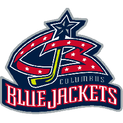
Columbus Blue Jackets
2000 - 2004
The original logo had a red ribbon with 13 stars representing the 13 Colonies, unfurled in the shape of the team’s initials, CBJ, with an electric gold hockey stick cutting through the center to represent the “J.” An additional star atop the stick represented Columbus' status as state capital. A wordmark "BLUE JACKETS" in white with red trim and "COLUMBUS" in silver above.
Sports Fan Products


The Columbus Blue Jackets are in the thick of the NHL League Teams Logo Battle, and fans can show their support by voting for their favorite logo. With a wide variety of teams competing, it's sure to be an exciting battle with lots of surprises along the way. Show your team pride and vote for your favorite today!
Hey Blue Jackets Fans ready to Vote
Click to go to NHL Logo Battle and vote

