Chicago Blackhawks
The current Blackhawk logo is a side view of an native American with war paint on his face in red, black and white. His hair is black with a yellow outline and has four different feathers in red, green, yellow, and orange.

Chicago Blackhawks
1997 - 2000
Again very minor and subtle changes to the native American logo. No change to the logo other than colors. The color of the face darkened, and the outline of the hair changed as well.
Chicago Blackhawks
1987 - 1997
In 1987 very minor and subtle changes to the native American logo. The face features have changed slightly. The colors of the face and the outline of the hair have changed as well.
Chicago Black Hawks
1966 - 1987
In 1965, the Black Hawks introduced a logo they still use to this day. The circle and lettering was dropped from the logo, leaving plenty of room for a larger Black Hawk head.
Chicago Black Hawks
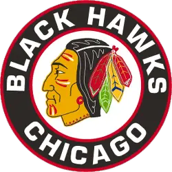
1958 - 1966
The circle and lettering around Black Hawk remained, but the native american face was altered. The drawing of the head was bigger, yellow outline in the black hair, the feathers in his hair became multicolored and red and white and red war paint was added to his face.
Chicago Black Hawks
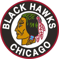
1956 - 1958
At the beginning of 1955, the logo changed and the head of the native American is starting to resemble the team's current primary logo. A red border has been added to the white background with the native American. A wordmark "BLACK HAWKS" on top and "CHICAGO" on the bottom.
Chicago Black Hawks
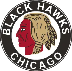
1942 - 1956
In 1942, the Black Hawks moved to an updated logo design. The native American has received a color makeover by adding green, blue and red. A wordmark "BLACK HAWKS" on top and "CHICAGO" on the bottom.
Chicago Black Hawks
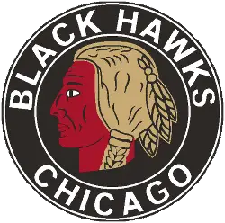
1938 - 1942
In 1938, the background behind the native American changed to white. The same brown and red native American. A wordmark "BLACK HAWKS" on top and "CHICAGO" on the bottom.
Chicago Black Hawks
1936 - 1938
Color appeared in this logo for the first time in 1935. The black and white circle and background remained, but Black Hawk’s hair was turned light brown and his skin red. A wordmark "BLACK HAWKS" on top and "CHICAGO" on the bottom.
Chicago Black Hawks
1927 - 1936
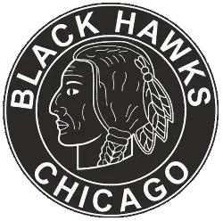
Owner Fred McLaughlin's wife, Irene Castle, designed the original version of the team's logo which featured a crudely drawn black and white Native head in a circle. A wordmark "BLACK HAWKS" encircled on top and "CHICAGO" on the bottom in white.
Revealing the Hidden Mysteries of Chicago Blackhawks Logo History
Unlock the secrets of Chicago Blackhawks Logo History in this captivating video! Delve into the fascinating journey of one of the most iconic logos in sports history. Discover the evolution, controversies, and design inspirations behind the emblem that symbolizes the spirit of the Chicago Blackhawks. Join us on this insightful exploration into the rich tapestry of Chicago Blackhawks Logo History.
The Striking Chicago Blackhawks Logo
Chicago Blackhawks primary logos energize hockey games with bold style. History of Chicago Blackhawks logo inspires designs that ignite fan passion. Furthermore, primary logo artwork attracts collectors with clear detail. Visit the official Chicago Blackhawks Wikipedia page. Consequently, fans value Blackhawks hockey heritage. They celebrate the team’s striking primary logo identity with enthusiasm.
"From the Original Six to the Modern Era"
Every jersey tells a story of championships won and rivalries forged on the ice. Honor the heritage of your franchise and gear up with authentic threads that celebrate decades of hockey history.
Shop the Official NHL Collection
