New Jersey Devils
The Devils’ logo is a monogram of the letters “N” and “J” rendered with devil horns at the top of the “J” and a pointed tail at the bottom. The logo sits inside an open black circle, and lies on a field of white.
New Jersey Devils
1993 - 2000
The team changes the secondary color from green to black. The logo did not change other than adding the black.

New Jersey Devils
1987 - 1993
The new logo would be a red melding of the New Jersey "N J" initials with identifiable images of a devil pointed tail and horns, set inside a green circle.
New Jersey Devils
1983 - 1987
The new logo of the New Jersey Devils combines the letters "N" and "J" with horns on the top of the "J" and a tail at the bottom. The logo is red with a green outline and a circle around it.
Colorado Rockies
1977 - 1982
The Scouts became the Rockies, named after the mountainous region. The logo consists of Colorado state flag drawn into the shape of a blue mountain with a red "C" and a yellow dot in the middle.
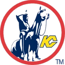
Kansas City Scouts
1975 - 1976
The Scout statue that overlooks the city was featured in the Kansas City logo. The Scouts statue is located in Penn Valley Park that depicts a Native American on horseback. A yellow with blue trim letters "KC" with a red circle around the statue.
The Fierce New Jersey Devils Logo
New Jersey Devils primary logos energize hockey games with bold style. New Jersey Devils logo history drives designs that ignite fan passion. Furthermore, New Jersey Devils hockey artwork attracts collectors with clear detail. Visit the official New Jersey Devils Wikipedia page. Consequently, fans value Devils hockey heritage. They celebrate the fierce primary logo identity with enthusiasm.
"From the Original Six to the Modern Era"
Every jersey tells a story of championships won and rivalries forged on the ice. Honor the heritage of your franchise and gear up with authentic threads that celebrate decades of hockey history.
Shop the Official NHL Collection
