The Colorado Rockies logo shines in the team’s wordmark logo collection, evolving since 1976 in the NHL. Its sleek text reflects Colorado’s rugged spirit. Therefore, the Colorado Rockies hockey team captivates collectors. Moreover, the Colorado Rockies NHL logo showcases vibrant identity and regional pride.
Colorado Rockies
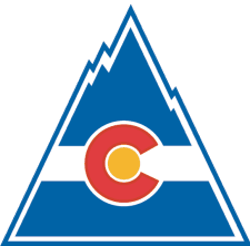
1977 - 1982
The Scouts became the Rockies, named after the mountainous region. The logo consists of Colorado state flag drawn into the shape of a blue mountain with a red "C" and a yellow dot in the middle.
Colorado Rockies
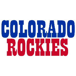
1977 - 1982
Double-lined wordmark "COLORADO" in blue on top and "ROCKIES" in red on the bottom.
Font: Custom
Rugged Colorado Rockies Logo
The Colorado Rockies logo, a bold red and blue “ROCKIES” wordmark, anchors the wordmark logo collection. Launched in 1976, it honors the Colorado Rockies hockey team heritage. Additionally, collectors love its clean design. Thus, it complements the team’s legacy. Check the Colorado Rockies Primary Logo.
The Colorado Rockies logo ignited passion at games, tied to the 1976-1982 NHL era before becoming the New Jersey Devils. Its colors echo Colorado Rockies NHL logo jersey designs. Consequently, it links fans to Colorado’s legacy. Furthermore, its impact endures, per the team’s Wikipedia page.