
Colorado Avalanche
The current logo has had a little shade added to it a few years later, but the actual logo hasn’t changed. The mountainous “A” stands prominently, with a streaking avalanche that wraps around and over, led by a black puck at the end, in the shape of the letter “C.”
Avalanche Alternate Logo
The Colorado Avalanche alternate logo has been a staple of the team since its inception in 1995. The original logo featured a snow-capped mountain range with an avalanche descending the center and was used until 1998. This primary design was an homage to the Rocky Mountains surrounding Denver, where they play their home games.
In 1998, the Avalanche changed its look by introducing a new alternate logo featuring two crossed hockey sticks above three snow-covered mountains and “Colorado” written across them in white font. This design was intended to represent Colorado's mountainous terrain and its passion for hockey - which is now synonymous with Denver sports culture today!
Today, this same basic concept remains intact; however, it has been updated to reflect modern trends in graphic design and branding standards set forth by other professional teams around North America. The current version features more vibrant colors, such as navy blue and bright yellow, along with subtle details like stars scattered throughout each mountain peak - making it one of the most recognizable logos among NHL fans everywhere!
Colorado Avalanche
2018 - Present
The letter "C" in burgundy with white and silver trim and the letter "O" in black centered. Based off of the state flag of Colorado.
Slight change to the color blue.

Colorado Avalanche
2016 - Present
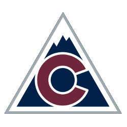
A white with sliver trim triangle with the letter "C" in burgundy with white trim on a dark blue mountain background.
Colorado Avalanche
2016 - 2017
A burgundy letter "C" with silver outline and a dark blue circle at the center. The letter "C" stands for the state of Colorado.

Colorado Avalanche
2000 - 2015
A burgundy and silver "Big Foot" foot with a blue oval circle around it. A slight variation of the previous 1996 - 1999 logo.
A new shade of burgundy.

Colorado Avalanche
1996 - 1999
A burgundy and silver “Big Foot” foot on a blue oval circle.
