
Phoenix Coyotes
2004 - 2014
In 2003 - 2004, the Coyotes introduced a much cleaner, less experimental design to represent the team. The color scheme was simplified to a brick and tan and the logo is way less busy than the hectic design that came before it.

Phoenix Coyotes
2009 - 2014
A double lined wordmark "PHOENIX" in sedona red and "Coyotes" scripted in tan with black outline on sedona red background.
Font: Sign Painter House Script
https://deltafonts.com/arizona-coyotes-font/

Phoenix Coyotes
2004 - 2008
Wordmark "COYOTES" in tan and red on black background, with "PHOENIX" above.
Font: Custom
Phoenix Coyotes
2000 - 2003
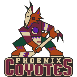
A sienna-coloured Coyote wearing half of a sand-coloured goalie mask and a brick red hockey jersey with hunter green pants. Clutching a sand hockey stick with a purple crescent moon logo on its chest. This logo was also used from 1997 until 1999 with a slightly brighter shade of brick red instead of what is seen here.
Font: Custom

Phoenix Coyotes
1997 - 2003
Double lined Wordmark "COYOTES" in brick color and "PHOENIX" in sand color all on black background.
Font: Custom
Bold Phoenix Coyotes Logo
"From the Original Six to the Modern Era"
Every jersey tells a story of championships won and rivalries forged on the ice. Honor the heritage of your franchise and gear up with authentic threads that celebrate decades of hockey history.
Shop the Official NHL Collection
