Minnesota Wild
The new and cleaner head of a black bear created using Minnesota-area scenery, green pine trees, a wheat colored river, a red sky, yellow sun set and white shooting star. The wordmark “Minnesota Wild” was removed from the previous logo.

Minnesota Wild
2000 - 2014
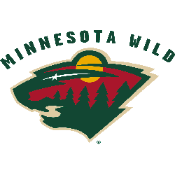
The original Wild logo features the head of a black bear created using Minnesota-area scenery, green pine trees, a wheat-colored river, a red sky, a yellow sunset, and a white shooting star. The wordmark "MINNESOTA WILD" is arched over the logo.
The Minnesota Wild Logo Evolution: From Concept to Icon!
In this video, we explore the evolution of the Minnesota Wild logo, from its inception to today. Join us as we discuss what makes it one of the most iconic logos in hockey history and trace its design journey since the team's NHL debut in 2000. We'll delve into the significance of the logo, highlighting key
The Fierce Minnesota Wild Logo
Minnesota Wild primary logos energize hockey games with fierce style. Minnesota Wild logo history fuels designs that ignite fan passion. Furthermore, Minnesota Wild NHL artwork attracts collectors with clear detail. Visit the official Minnesota Wild Wikipedia page. Consequently, fans value Wild hockey heritage. They celebrate the team’s fierce primary logo identity with enthusiasm.
"From the Original Six to the Modern Era"
Every jersey tells a story of championships won and rivalries forged on the ice. Honor the heritage of your franchise and gear up with authentic threads that celebrate decades of hockey history.
Shop the Official NHL Collection

