San Jose Sharks
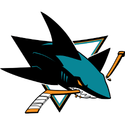
The new and still active primary logo arrived for 2007 – 2008. The shark is much more three-dimensional, menacing, powerful. It’s bursting out of the logo to bite the hockey stick. Its teeth are razor sharp and its eyes glow with the same yellowy orange.
Sharks Primary Logo
The San Jose Sharks' primary logo has been a part of the team's identity since its inception in 1991. The original logo, designed by Terry Smith and Tom O'Grady, featured a teal shark with orange eyes and an open mouth surrounded by an oval border. This design has remained unchanged over the years, but some minor tweaks have been made along the way.
In 1998, when the team changed their color scheme from teal to black and grey, they also updated their primary logo slightly to reflect this change - making it darker overall with sharper edges on all elements contained within it. In 2007 another update was made; this time adding more detail, such as scales around the outside of the body, while keeping true to its original design concept.
Today’s version is much brighter than previous iterations due in part to new colors being added into the mix, like yellow for highlights on eyes and fins as well as white for additional details around teeth area inside the mouth cavity – giving fans' favorite mascot icon look that is both modern yet timeless at the same time! With these subtle changes over the years, San Jose Sharks have kept up-to-date with current trends while staying true to core values set forth by founders nearly 30 years ago – showing just how powerful simple yet effective designs can be when done right!

San Jose Sharks
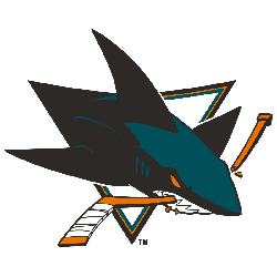
2008 - 2009
In 2008, a redesigned of the Sharks logo changed the shark position and look. The shark add a new color teal with black and white. The shark is still coming out of the top left corner and biting on a hockey stick.

San Jose Sharks
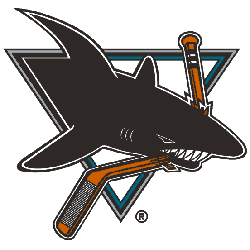
1999 - 2008
In 1999 the Sharks made very small changes to the original logo. The black and white shark is still coming out of one of the corners of the triangle. The shark is crushing a hockey stick.

San Jose Sharks
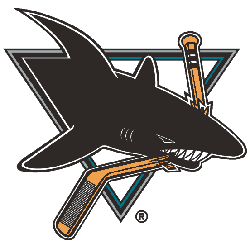
1992 - 1999
According to the brain trust behind the design, the decision was deliberate, as they didn’t want to scare children. And the triangle wasn’t simply capitalizing on Pittsburgh’s success at the time, it actually stands for the Bay Area trifecta of San Jose, San Francisco and Oakland.
Sports Fan Products
The NHL League Teams Logo Battle is a great way for San Jose Sharks sports fans to show their team spirit and support their favorite team. With the battle taking place online, it's easy to cast your vote and get involved in the competition. Show your pride by voting for the Sharks' logo today!


