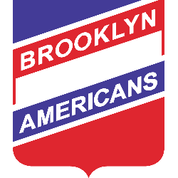
Brooklyn Americans
1941 - 1942
Diagonal wordmark "BROOKLYN AMERICANS" in white on a red, white, and blue shield.
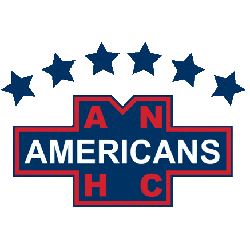
New York Americans
1939 - 1940
Wordmark "AMERICANS" in white on blue background with several letters "ANHC" in red with four blue stars above.
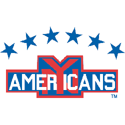
New York Americans
1936 - 1939
An interlocking NY in red behind a wordmark "AMERICANS" in white. Six blue stars above.
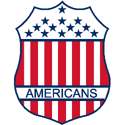
New York Americans
1934 - 1936
Red, white and blue shield designed like the US flag with a wordmark "AMERICANS" in blue.
New York Americans
1926 - 1934
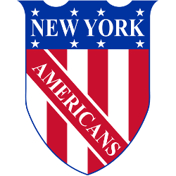
A shield with red and white vertical stripes and eight white stars near the top, wordmark "NEW YORK AMERICANS" on blue and red stripes written on the shield.

Hamilton Tigers
1924 - 1925
Black letter "H" with a wordmark "TIGERS" in orange in the middle of the letter. The letter "H" represents the city of Hamilton, Canada.

Hamilton Tigers
1922 - 1924
A full body yellow with black highlights tiger walking.

Hamilton Tigers
1921 - 1922
A orange with black highlights tiger’s head facing to the left.

Quebec Bulldogs
1913 - 1920
A blue letter "Q." The letter "Q" represents the city of Quebec.

Quebec Bulldogs
1911 - 1913
A blue letter "Q." The letter "Q" represents the city of Quebec.
Patriotic Brooklyn Americans Logo
The Brooklyn Americans logo, a red, white, and blue shield with stars, leads the primary logo collection. Introduced in 1941 for the Brooklyn Americans hockey team’s final NHL season, it honors U.S. identity. Collectors prize its bold design. Additionally, view the Brooklyn Americans Wordmark Logo.
"From the Original Six to the Modern Era"
Every jersey tells a story of championships won and rivalries forged on the ice. Honor the heritage of your franchise and gear up with authentic threads that celebrate decades of hockey history.
Shop the Official NHL Collection
