Los Angeles Kings
A throwback logo to the one used by the club from 1988 to 1998. A wordmark “KINGS” in black italic with white highlight with black speed lines on a silver with white and black trim banner over a crown in black, and a wordmark “Los Angeles” is black on top.
Los Angeles Kings
2020 - 2025
A black, white, and silver pennant with the initials "LA" in white above a king's black, white, and silver crown.
One additional silver stripe was added to the outside of the shield border.
Los Angeles Kings
2013 - 2020
Initials "LA" in white on a black pennant with silver, white and black trim and a crown with hockey sticks at the bottom.
A white and black outline was added to the outside of the shield
Los Angeles Kings
2012 - 2013
This logo returns to the main shape of the design of a pennant, as their first logo was. Now in black and silver with a large initials "LA" in white at the top and a crown at the bottom.
Promotion of their third jersey logo to primary status.
Los Angeles Kings
2003 - 2012
In 2003, the Kings went back to a large crown for their logo, but this crown was more modern and retained the blue, black and grey colors of the previous shield. For the first time, there was no mention of the city’s name or the team name on the logo.
Los Angeles Kings
1999 - 2003
Ten years after the silver-and-black logo was unveiled, the Kings changed logos again and they made substantial alterations to the crown, which shrunk drastically and was moved to the upper left corner of a shield that also included a shining sun, a lion, and two hockey sticks. The color scheme also changed: grey was minimized, and black and blue were emphasized.
Los Angeles Kings
1996 - 1999
The Kings logo went completely black. The small crown on the bottom is now in black. The outline has changed to go around all the text. The wordmark "LOS ANGELES" in black on top and the "KINGS" in black in the middle with streaking lines.
White shadowing was eliminated on the wordmark "KINGS."
Los Angeles Kings
1989 - 1996
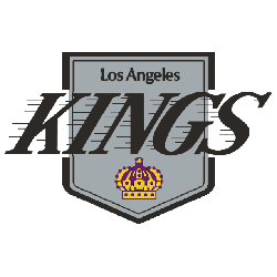
The Kings adopted a black and silver look while updating the logo slightly. The wordmark "KINGS" script now also enclosed within the shape of the original Kings pennant design.
Often referred to as the Chevrolet logo by fans due to its similarity in shape to the car company logo.
Los Angeles Kings
1988 - 1989
In 1988, the Kings’ logo changed drastically. Gone was the purple and gold, replaced by a black-and-silver version of their previous logo. The change coincided with the acquisition of NHL icon Wayne Gretzky, and their new colors were a match with a different Los Angeles team called the Raiders.
Los Angeles Kings
1976 - 1988
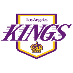
After eight seasons, the Kings changed logos for the first time. The team added horizontal lines around the name to provide a sense of speed again similar to the Lakers logo. A wordmark "LOS ANGELES" in purple on top and "KINGS" in the middle in purple. A small crown at the bottom with a yellow and purple border in the shape of a hanging banner.

Los Angeles Kings
1968 - 1976
When the Kings debuted in the 1967 - 1968 season, the first logo was a traditional crown emblazoned with jewels with busy design elements for detail. A wordmark "LOS ANGELES" in purple at the top and "KINGS" in purple in larger letters above the crown. All surrounded by a yellow and purple border in the shape of a hanging banner.
Nostalgia in Modern Design with Los Angeles Kings!
We explore the fascinating world of retro logo trends and their resurgence in contemporary branding. Discover how designers incorporate nostalgia into modern logos, from vintage-inspired typography to classic color palettes...
The Regal Los Angeles Kings Logo
Los Angeles Kings primary logos energize hockey games with bold style. Los Angeles Kings logo history fuels designs that ignite fan passion. Furthermore, NHL Los Angeles Kings logo artwork attracts collectors with clear detail. Visit the official Los Angeles Kings Wikipedia page. Consequently, fans value Kings hockey heritage. They celebrate the team’s regal primary logo identity with enthusiasm.
"From the Original Six to the Modern Era"
Every jersey tells a story of championships won and rivalries forged on the ice. Honor the heritage of your franchise and gear up with authentic threads that celebrate decades of hockey history.
Shop the Official NHL Collection

Hey, Kings Fans - Cast Our Vote!
The NHL Team Logo Battle brings the Los Angeles Kings emblem into the spotlight. This iconic symbol reflects regal pride and unyielding resolve. Featuring a bold crown and the name LA Kings, it represents the team’s royal heritage and enduring strength.
Rooted in the sun-soaked spirit of Los Angeles, the logo captures the Kings’ relentless drive and loyal fan base. Supporters proudly wear it as a badge of honor. In this fierce competition, our emblem pushes toward the top, showcasing the determination and pride that define the Los Angeles Kings.
