Chicago Bulls
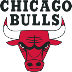
The iconic Bulls’ logo is comprises of the face of an angry and fierce red bull whose horns are tipped with blood. A wordmark “CHICAGO BULLS” in black above the bull. The logo was designed by noted American graphic designer Dean P. Wessel, a commercial designer and owner of a commercial design firm and the logo was adopted in 1966.
Chicago Bulls
1967 - Present
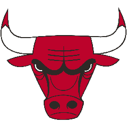
A red bull with two white, red-tipped horns.
The wordmark "CHICAGO BULLS" is removed from the primary logo.
Chicago Bulls
1970 - 1979
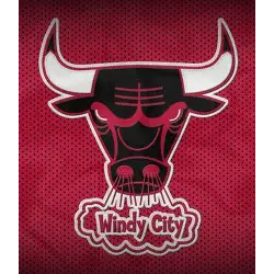
The Bulls also have an alternate logo during the early 70s, featuring the same Bulls logo in black with red highlights, but with a cloud that says "Windy City" below the bull's nose on a red matted background.
Chicago Bulls Logo History Exposed: Everything You Need to Know!
Delve into the rich tapestry of Chicago Bulls Logo History! This comprehensive guide takes you through the evolution of one of the NBA's most recognizable symbols. Discover the origins, design transformations, and intriguing anecdotes that define the Chicago Bulls emblem. Gain insight into its significance and evolution, offering a deeper understanding of the team's legacy.

