
Charlotte Hornets
The new Hornets logo utilizes the purple and teal color palette and features an aggressive looking hornet that is ready to attack. Its piercing eyes, raised antennae, expanded wings and pointed stinger depict its relentless intensity. Incorporated within the logo is a basketball that doubles as the hornet’s body. The logo contains several odes to that of the original Hornets with its white wings, white accents within its eyes, a stinger and the inclusion of a basketball. A wordmark “CHARLOTTE HORNETS” in white.
Hornets Primary Logo
The Charlotte Hornets have been around since 1988, and their primary logo has gone through a few changes over the years. The original logo featured an angry-looking hornet with its stinger raised in a menacing pose. This design was used until 2002 when it was replaced by one featuring a more realistic-looking hornet wearing sneakers and holding onto basketballs with both hands. This version of the logo lasted just four seasons before being retired in favor of another cartoonish design that featured two intertwining horns that formed an “H” shape for “Hornets” on top of two crossed basketballs.
Overall, Charlotte Hornets' primary logo has evolved significantly over time but still manages to maintain some semblance to its origins while embracing newer trends in graphic design elements like bold colors, sharp lines, and simple shapes. As such, this latest iteration is sure to be embraced not only by diehard fans but also newcomers alike who will appreciate everything that goes into creating such an iconic visual representation for one NBA's most beloved franchises today!

Charlotte Bobcats
2013 - 2014
In 2013 a new color scheme added to the existing logo. The Bobcat is now gray and not orange. The wordmark "BOBCATS" is now in white, and the wordmark "CHARLOTTE" is now in orange and inside the logo, not on top of the logo.
Charlotte Bobcats
2008 - 2013
Slight change in color of bobcat, as the orange is a little lighter in color. All other items in the logo did not change.

Charlotte Bobcats
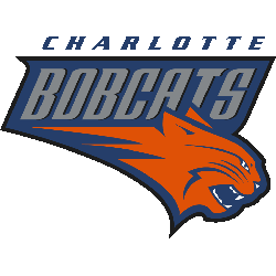
2005 - 2008
The first Bobcats logo comprises of a snarling orange bobcat with the wordmark "BOBCATS" above the cat. An additional wordmark on top of the logo "CHARLOTTE" in blue.
Basketball Sports Fan Products


Hornets Enthusiasts: Time to Exercise Your Vote
Click to go to NBA Logo Battle and vote