New York Nets
1973 - 1977
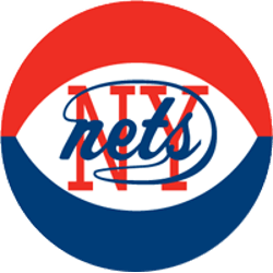
In 1972, the Nets opted to continue the previous logo with a red, white and blue basketball, much like the one the ABA used during games. They did retain the previous main logo, blue wordmark "nets" against a red block "NY."
Nets Wordmark Logo
The New York Nets have a long and storied history in the NBA. The team has gone through several iterations, including its original name the New Jersey Americans and then later becoming part of the ABA as one of its founding franchises. Throughout this time, they have had various logos to represent their team identity.
The first logo for the Nets was used during their time in ABA from 1967-76 when they were known as "the Americans". It featured an orange basketball with two stars above it along with a blue background featuring white lines that created a net-like pattern around it. This design was unique and distinct from other teams at that time, setting them apart visually on the court or on merchandise items like jerseys or hats.
In 1976 when they joined up with NBA after merging into one league, their logo changed again to feature just an orange basketball outlined in black against a white circle background surrounded by red trimming which made it stand out even more than before still keeping some elements from previous designs such as color palette choice (orange) & net pattern (circle). This is what we now know today as “the classic” look for Brooklyn/New York Nets wordmark Logo History which has been used consistently since then until the present day despite a few minor tweaks here & there over years depending on season/player changes etc...

New York Nets
1972 - 1977
A double line wordmark for the Nets. On top in blue "NEW YORK" and on the bottom in a bold read "NETS."
Font: Unknown


