Chicago Blackhawks
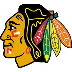
The current Blackhawk logo is a side view of an native American with war paint on his face in red, black and white. His hair is black with a yellow outline and has four different feathers in red, green, yellow, and orange.
Blackhawks Alternate Logo
The Chicago Blackhawks alternate logo has been a part of the team’s history for many years. The original alternate logo was introduced in 1965 and featured an Indian head with a single feather on top of it, set against an orange background. This design remained unchanged until 1999, when the team replaced it with a new version featuring two feathers instead of one. Since then, the Blackhawks have undergone several changes to their alternate logos over time, each reflecting different aspects of their identity and keeping up with current trends in sports branding and design.
In 2010, the Hawks unveiled yet another new look for their alternates, incorporating elements from traditional Native American art and modern graphic design into its overall aesthetic appeal. This particular version features three feathers arranged around an abstract image that looks like a war bonnet or headdress; this is meant to symbolize strength and courage while also paying homage to Native American culture throughout North America that has been so influential on hockey teams such as the Blackhawks over time.
Today’s iteration of Chicago's alternative logo is still heavily inspired by traditional Native American designs. Still, it now includes more contemporary elements such as bright colors along with sharp angles, which are intended to reflect speediness associated not only with hockey but also with other forms of sports activities like skiing or snowboarding - something very much appreciated by young fans who identify strongly with these kinds extreme sports today! However, no matter how many times may change, there will always be some connection between this iconic NHL franchise based out of Illinois' largest city windy city: Chicago!
Chicago Blackhawks
2010 - 2011
A red letter "C" with tan and red tomahawks crossed over it. The letter "C" stands for the city of Chicago.

Chicago Blackhawks
2000 - Present
A yellow letter "C" with red and green tomahawks crossed over it, worn on the Chicago Blackhawks red jersey starting in 1999 - 2000 season. The letter "C" stands for the city of Chicago.

Chicago Blackhawks
2000 - Present
A yellow letter "C" with green and white tomahawks crossed over it, worn on the Chicago Blackhawks red jersey starting in 1999 - 2000 season. The letter "C" stands for the city of Chicago.

Chicago Blackhawks
2000 - Present
A gold with black trim letter "C" with red, green, and black crossed tomahawks.

Chicago Blackhawks
1997 - 1999
A yellow letter "C" with green and white tomahawks crossed over it. The letter "C" stands for the city of Chicago.

Chicago Blackhawks
1997 - 1999
A yellow letter "C" with green and red tomahawks crossed over it. The letter "C" stands for the city of Chicago.

Chicago Blackhawks
1990 - 1996
A yellow letter "C" with green and red tomahawks crossed over it. The letter "C" stands for the city of Chicago.

Chicago Blackhawks
1990 - 1996
A yellow letter "C" with green and white tomahawks crossed over it. The letter "C" stands for the city of Chicago.

Chicago Blackhawks
1987 - 1989
A yellow letter "C" with green and white tomahawks crossed over it. The letter "C" stands for the city of Chicago.

Chicago Blackhawks
1987 - 1989
A yellow letter "C" with green and red tomahawks crossed over it. The letter "C" stands for the city of Chicago.

Chicago Blackhawks
1960 - 1986
A yellow letter "C" with green and red tomahawks crossed over it. The letter "C" stands for the city of Chicago.

Chicago Blackhawks
1960 - 1986
A yellow letter "C" with green and white tomahawks crossed over it. The letter "C" stands for the city of Chicago.

Chicago Blackhawks
1956 - 1959
A red letter "C" with white and yellow tomahawks crossed over it. The letter "C" stands for the city of Chicago.

Chicago Blackhawks
1956 - 1959
A yellow letter "C" with white and red tomahawks crossed over it. The letter "C" stands for the city of Chicago.

Chicago Blackhawks
1956 - 1957
A red letter "C" with white and red tomahawks crossed over it. The letter "C" stands for the city of Chicago.

Chicago Blackhawks
1956 - 1957
A red letter "C" with black and red tomahawks crossed over it. The letter "C" stands for the city of Chicago.
