Charlotte Bobcats
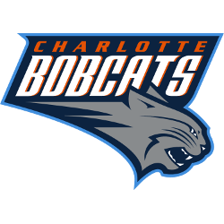
2013 - 2014
In 2013 a new color scheme added to the existing logo. The Bobcat is now in gray and not orange. The wordmark "BOBCATS" is now in white and the wordmark "CHARLOTTE" now in orange and inside the logo and not on top of the logo.

Charlotte Bobcats
2008 - 2013
Slight change in color of bobcat, as the orange is a little lighter in color. All other items in the logo did not change.

Charlotte Bobcats
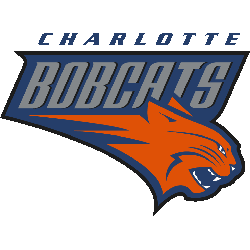
2005 - 2008
The first Bobcats logo comprises of a snarling orange bobcat with the wordmark "BOBCATS" above the cat. An additional wordmark on top of the logo "CHARLOTTE" in blue.
The Prowl of the Charlotte Bobcats Logo
The Charlotte Bobcats logo history began in 2004 with a snarling orange bobcat. First, the Charlotte Bobcats old logo used blue and orange hues. Then, a 2012 redesign shifted to a gray cat since fans wanted a sharper look. Now, it’s a nostalgic emblem. Visit the NBA Hornets page for team details.
"Legends Live on the Court. Legacies are Worn Every Day"
From the hardwood of the 80s to the high-flying stars of 2026, the game is always with you. Whether you're repping a Hall of Fame icon or the league's newest MVP, find the official colors that define your game.
Shop the Official NBA Store
