New Jersey Nets
1998 - 2012
The Nets brought back the shield concept from their first logo while keeping the basketball that has been part of all but one. Most significantly, the team changed its color scheme for the first time: deepening the red and swapping royal blue for navy, also adding silver and dark grey.
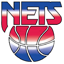
Nets Primary Logo
The New Jersey Nets have had a long and storied history, dating back to their inception in 1967. Throughout the years, they've gone through several iterations of primary logos that reflect both the team's identity and its changing culture over time. The first logo was created when the team joined the American Basketball Association (ABA) in 1967 as part of an expansion effort. It featured a basketball with two stars above it representing each conference within ABA at that time - Eastern and Western Divisions - along with a red circle containing “Nets” written inside it to represent their name change from “Americans” to “Nets” for this new league venture.
In 1976, after becoming part of the NBA following an ABA merger with them, they transitioned into another logo that included three stripes on top resembling those found on military uniforms while also featuring two blue stars similar to ones used before but now placed around "NETS" lettering instead; these symbols were meant to honor veterans who served our country during war times like World War II or Vietnam War among others by showing respect towards them through this design choice made by organization's management at that point in the time period.
Finally, upon moving from New Jersey into the Brooklyn borough located within NYC metropolitan area prior 2012-13 season start date, the franchise opted out of creating yet another version which kept the same basic elements such as 3 stripes & 2 blue stars but added a few more details including one additional star plus white color outline surrounding entire emblem thus making it look much more modernized than previous designs did all while still keeping traditional aspects intact so fans could recognize easily without any problems whatsoever. All these changes throughout the years demonstrate how important visual identity is when comes down branding teams correctly in order to be successful both financially and competitively speaking alike.
New Jersey Nets
1991 - 1998
The red, white and blue gradient featured an all caps block "NETS" floating above a basketball that shared the same hues, hearkening back to the team's time in the ABA.
New Jersey Nets
1979 - 1991
The Nets incorporated the state silhouette into a completely redesigned logo, doing away with the wordmark "nets" for a block lettered "Nets" in white, against a red and blue circle. In addition, a wordmark in the upper right corner "New Jersey" in white.
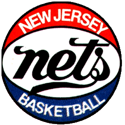
New Jersey Nets
1978 - 1979
For the team's first season in New Jersey, the team dropped the block "NY," keeping the familiar wordmark "nets" and the lettering is enlarged and darkened, now black rather than blue. A wordmark "NEW JERSEY" "BASKETBALL" in white above and below the scripted "nets."