Soar into the legacy of the St. Louis Hawks logo and its timeless tale. From classic designs to bold emblems, we unpack the St. Louis Hawks history, share St. Louis Hawks NBA details, and spotlight the Hawks symbol, celebrating the team’s proud spirit for every Hawks fan.
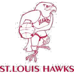
St. Louis Hawks
1958 - 1968
In 1957 the Hawks introduced this Disney-looking cartoon red hawk holding a basketball wearing a Hawks uniform and a wordmark "ST. LOUIS HAWKS" below the hawk. The hawk also has kneepads on each knee.
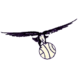
St. Louis Hawks
1956 - 1958
In 1955 the Hawks moved to St. Louis and introduced a similar black colored hawk soaring and holding basketball in it's claws without any wordmark.
The Flight of the St. Louis Hawks Logo
The St. Louis Hawks history began in 1955 after moving from Milwaukee. First, the St. Louis Hawks logo featured a blue hawk clutching a basketball. Then, a cartoonish red hawk emerged in 1957 since fans loved its energy. Now, it’s a classic Hawks symbol. Visit the NBA Hawks page for team details.
The 1957 St. Louis Hawks logo showcased a red hawk in a uniform, a bold Hawks symbol of the St. Louis Hawks NBA era. Because it’s iconic, fans seek St. Louis Hawks logo png files for wallpapers. For unique designs, check our Atlanta Hawks Primary logo. It captures the team’s fiery spirit.

