Our St. Louis Bombers logo collection highlights the team’s brief but impactful Missouri legacy. From BAA roots to bold designs, learn about St. Louis Bombers history, revisit St. Louis Bombers NBA moments, and explore St. Louis Bombers jersey emblems, showcasing classic logos for every Bombers fan.
St. Louis Bombers
1947 - 1950
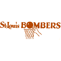
Wordmark "St. Louis" and "BOMBERS" in red with the letter "O" being a basketball above a basket and a hand going after the ball.

St. Louis Bombers
1947 - 1950
Wordmark "St. Louis" and "BOMBERS" in red with the letter "O" being a basketball above a basket and a hand going after the ball.
The Blast of the St. Louis Bombers Logo
The St. Louis Bombers began in 1946 as a BAA charter team, joining the NBA in 1949. First, the St. Louis Bombers logo featured “St. Louis Bombers” in orange with the “O” as a basketball tipped in a basket. Then, its design endured since fans valued its bold simplicity. Now, it’s a rare classic. Visit the NBA Wizards page for team details.
Our St. Louis Bombers logo collection features the 1946 basketball-tipped design, a standout for St. Louis Bombers NBA fans. Collectors often seek St. Louis Bombers logo png files to recreate authentic St. Louis Bombers jersey styles. For unique variations, visit our NBA logo collection. This collection preserves the Bombers’ 1946–50 legacy, including three playoff appearances despite folding due to low attendance.


