Capture the vibrant legacy of the San Francisco Warriors logo and its Bay Area roots. From NBA beginnings to bold designs, we dive into San Francisco Warriors history, share San Francisco Warriors basketball spirit, and highlight San Francisco Warriors cap emblems, celebrating the team’s glory for every Warriors fan.
San Francisco Warriors
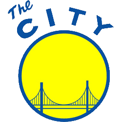
1970 - 1971
The 1970 logo is a silhouette of the Golden Gate Bridge on a yellow background circle with a wordmark "The City" in blue above the yellow circle. "The City" refers to the city of San Francisco.
San Francisco Warriors
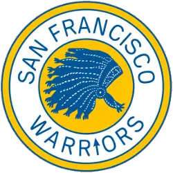
1963 - 1970
The first San Francisco logo is a blue and white Indian headdress in a yellow circle with the wordmark "SAN FRANCISCO WARRIORS" in blue. The "I" in warriors is an arrow.
The Spirit of the San Francisco Warriors Logo
The San Francisco Warriors history began in 1962 after moving from Philadelphia. First, the San Francisco Warriors logo featured a blue and gold Native American headdress. Then, a 1969 basketball design emerged since fans loved its energy. Now, it’s a nostalgic emblem. Visit the NBA Warriors page for team details.
The 1969 San Francisco Warriors logo, a basketball with “The City” text, tied to San Francisco Warriors basketball pride. Because it’s iconic, fans seek San Francisco Warriors logo png files for San Francisco Warriors cap designs. Check our San Francisco Warriors alternate logo for unique styles. It reflects the team’s bold heritage.


