Slam into our Rochester Royals basketball logo collection, showcasing the team’s storied New York legacy. From early NBA triumphs to bold emblems, dive into Rochester Royals history, relive Rochester Royals NBA pride, and explore the iconic Rochester Royals logo, celebrating vibrant designs for every Royals fan.
Rochester Royals
1946 - 1957
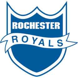
The initial Rochester Royals logo featured a blue and white shield with the wordmark "ROCHESTER" on the top in white and a white banner with the wordmark "ROYALS" on it.

Rochester Royals
1946 - 1957
The initial Rochester Royals logo featured a blue and white shield with the wordmark "ROCHESTER" on the top in white, with a white banner with the wordmark "ROYALS" on it.
The Glory of the Rochester Royals Basketball Logo
The Rochester Royals history began in 1945 in the NBL, joining the NBA in 1948. First, the Rochester Royals logo featured a blue crown with a red basketball. Then, a 1955 sleek crown design emerged since fans loved its regal flair. Now, it’s a timeless classic. Visit the NBA Kings page for team details.
Our Rochester Royals basketball logo collection highlights the 1955 crown, a gem for Rochester Royals NBA fans. Because it’s iconic, collectors seek Rochester Royals logo png files for custom gear. For unique designs, check our NBA logos. It captures the team’s championship spirit.

