New Jersey Nets
1998 - 2012
The Nets brought back the shield concept from their first logo while keeping the basketball that has been part of all but one. Most significantly, the team changed its color scheme for the first time: deepening the red and swapping royal blue for navy, also adding silver and dark grey.

New Jersey Nets
1991 - 1998
The red, white and blue gradient featured an all caps block "NETS" floating above a basketball that shared the same hues, hearkening back to the team's time in the ABA.

New Jersey Nets
1979 - 1991
The Nets incorporated the state silhouette into a completely redesigned logo, doing away with the wordmark "nets" for a block lettered "Nets" in white, against a red and blue circle. In addition, a wordmark in the upper right corner "New Jersey" in white.
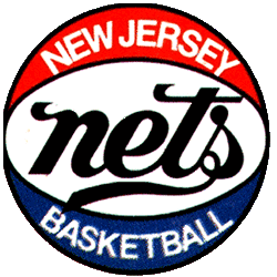
New Jersey Nets
1978 - 1979
For the team's first season in New Jersey, the team dropped the block "NY," keeping the familiar wordmark "nets" and the lettering is enlarged and darkened, now black rather than blue. A wordmark "NEW JERSEY" "BASKETBALL" in white above and below the scripted "nets."
The Pulse of the New Jersey Nets Logo
Basketball Sports Fan Products