Los Angeles Clippers
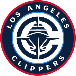
A navy blue ship acting as a nautical rose with a letter “C” behind it on a white background with an encircled wordmark “LOS ANGELES CLIPPERS” in white on a blue with red trim background.
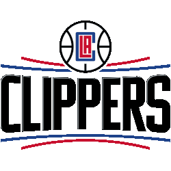
Los Angeles Clippers
2019 - 2025
Wordmark "CLIPPERS" in black with a silver lining between two arched horizontal red and blue lines on either side. A basketball with the initials "LAC" in the center of the basketball and above the wordmark.
The team changed the shades of red and blue.

Los Angeles Clippers
2015 - 2019
The curved lines in the primary Clippers wordmark symbolize the horizon of the ocean as seen from the bridge of a Clipper ship – alluding to the team’s nautical theme roots. Unique, iconic, and distinctly “L.A.” logo, the Clipper's new LAC monogram depicts a blue “C” wrapping around the “L.A.,” literally embracing the city. The stacked LA resembles a basketball court, signifying “LA Basketball.” In addition, the silver lining seen in the Clippers' wordmark signifies the renewed collective optimism of Clipper Nation.
Los Angeles Clippers
2011 - 2015
The Clippers logo 2011 with an updated wordmark "LOS ANGELES CLIPPERS" corrected the lines on the red outlined basketball.
A new shade of blue and red.
Los Angeles Clippers
1985 - 2011
Apart from swapping Los Angeles for San Diego, the Clippers are using the same logo as was used in San Diego, only adding the city of "LOS ANGELES" in blue.

San Diego Clippers
1983 - 1984
In 1983, the Clippers unveiled a breezy royal blue wordmark “SAN DIEGO CLIPPERS” superimposed over a red-seamed basketball, the logo they’ve essentially had as their primary logo for the past 28 years.
San Diego Clippers
1979 - 1983
For their first few seasons in San Diego, the Clippers sported a abstract motif of three large white masts on a blue circle with an orange sun over the wordmark "SAN DIEGO" in blue and "Clippers" in red.
Buffalo Braves
1972 - 1978
The final logo for the Braves is a red feather hanging off a large blue letter "B" over the wordmark "BUFFALO BRAVES" in red.
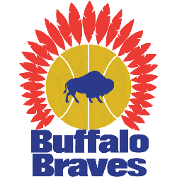
Buffalo Braves
1971 - 1972
The original Braves logo is a blue buffalo on a yellow basketball topped with red feathers over the blue wordmark "Buffalo Braves."
The Incredible History of the Los Angeles Clippers Logo
Explore the heart of the action with our exclusive coverage of the Los Angeles Clippers. From jaw-dropping highlights to insider secrets, this video unveils the captivating journey of one of basketball's most formidable teams. Join us as we explore the triumphs, tribulations, and enduring legacy of the Los Angeles Clippers. Don't miss out—hit play now and experience the thrill firsthand!
Top Sports Historian Shares Hidden Truths of LA Clippers Logo
In a captivating exploration of sports branding, a top sports historian delves into the hidden truths behind the iconic LA Clippers logo, revealing layers of meaning and cultural significance often unnoticed by fans. Initially introduced in 1984, the logo has undergone several transformations, yet...
Evolution of the Los Angeles Clippers Logo
Basketball Sports Fan Products
