
Houston Rockets
A red letter “R” shaped like a rocket ship blasting off on a black and graphite basketball planet with a wordmark “”HOUSTON ROCKETS” in white ringed around it.
Rockets Primary Logo
The Houston Rockets have a long and storied history with their primary logo. The first logo was designed in 1971 when the team joined the NBA as an expansion franchise. It featured a basketball player shooting a rocket, which symbolized both power and speed, two qualities that would become synonymous with the team over its years of success. The original design underwent several minor changes throughout its lifetime until it was replaced by another iconic logo in 1995: “the H-Town Logo” or “Clutch City” as it has come to be known among fans of all ages. This new design featured an abstract red letter "H" within an orange circle outlined with white stars, representing Houston's place on Texas' Lone Star flag.
In 2003, another redesign occurred which saw the addition of black coloring to give more depth to the overall look while still maintaining many elements from previous logos such as stars and circles around thematic imagery like rockets or basketballs for example; this is also where we get our current primary logo today - one that stands out amongst other teams due mainly because it is so distinctively different than most others across professional sports leagues worldwide, particularly in relation to the Houston Rockets Alternate logo!
The Rockets have had three main variations on their primary logos since joining up with NBA back in 1971 – each featuring some combination of symbols related either directly or indirectly to space exploration (like rockets) or athletic prowess (like basketball players). From the beginning till now these designs have been tweaked just enough times over decades so they remain recognizable but fresh at the same time; something very unique about how this organization approaches branding itself through visual identity!
Houston Rockets
2004 - 2020
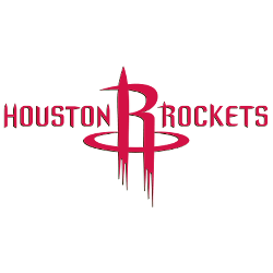
In the 2003 - 2004 season, the Houston Rockets returned to their traditional Rockets red and white color scheme with a more modern, space-aged Houston Rockets logo, which depicts an "R" that takes off like a rocket ship with twin boosters. The "R" is in the middle of the wordmark "HOUSTON ROCKETS" in red.

Houston Rockets
1996 - 2004
No longer did the Houston Rockets logo feature the iconic Rockets red and gold but a new color scheme of red, white, and blue. The Houston Rockets logo included a red basketball with blue outline and a cartoon-like depiction of a rocket ship with a mouth and eyes, this logo was revealed while aboard the Space Shuttle!

Houston Rockets
1973 - 1996
The next Houston Rockets logo incorporated the same color scheme of red and gold. This time around, the logo featured a golden and orange basketball with a thick red outline. The wordmark "HOUSTON" is printed in white and the wordmark "ROCKETS" is printed in black letters across the basketball.

Houston Rockets
1972
A new logo arrived as the team moved to Houston, which featured a cartoon depiction of a basketball player wearing a red and gold uniform and spinning a yellow "NBA" basketball. The propulsion from the rocket goes into the wordmark "HOUSTON ROCKETS" in orange.

San Diego Rockets
1968 - 1971
The original Rockets logo is a blue rocket on a orange basketball in the middle of a green ring with the wordmark "san diego ROCKETS" in gold.
Basketball Sports Fan Products
