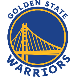
Golden State Warriors
Bay Bridge in blue on a yellow circle with wordmark “GOLDEN STATE WARRIORS” surrounding it, font and bridge updated for 2019-20 season.
Golden State Warriors
2020 - Present
Wordmark "The" scripted and "BAY" in blue above a blue and yellow circle of the bay as a basketball.
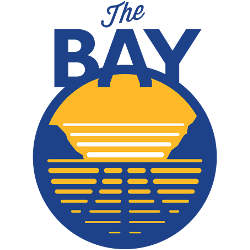
Golden State Warriors
2020 - Present
Beveled letter "W" in yellow and blue on a blue background with yellow outline circle.

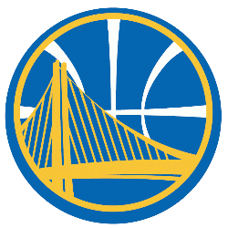
Golden State Warriors
2020 - Present
The Bay Area bridge in yellow on a blue circle with a yellow circle trim.

Golden State Warriors
2010 - 2019
Variation of the primary logo, a invert of the colors. A wordmark on top "GOLDEN STATE" and "WARRIORS" on the bottom of Bay Bridge profile.

Golden State Warriors
2010 - 2019
A map of the State of California in gold outlined in light blue and white with a white letter "W" on top. The letter "W" stands for the team nickname Warriors.

Golden State Warriors
2010 - 2019
The span of the new Bay Area Bridge in yellow on a blue with white seam basketball.
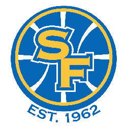
Golden State Warriors
2010 - 2019
The initials "SF" in gold with a blue outline on a blue with white seams basketball with gold outline. The letters "SF" stand for the city of San Francisco.
Golden State Warriors
1998 - 2010
Gold letter "W" with lightning bolts on either side on top of a orange basketball. The letter "W" stands for the team nickname Warriors.

Golden State Warriors
1998 - 2006
A light blue, orange and dark blue warrior's head on an orange triangle with a dark blue outline.

Golden State Warriors
1973 - 1975
In 1973 the logo reversed the wordmark positions, putting "WARRIORS" on top and adding "BASKETBALL" on the bottom.

From Indian Head to Bay Bridge: The Golden State Warriors Logo Evolution Story
Embark on an extraordinary journey through the evolution of one of the NBA's most iconic franchises as we explore the complete history of the Golden State Warriors logo, from its Philadelphia roots in 1946 to its modern-day Bay Area identity. This comprehensive visual story traces the transformation from the original Native American-inspired design of the Philadelphia Warriors...