Colorado Avalanche
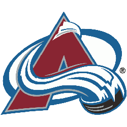
The current logo has had a little shade added to it a few years later, but the actual logo hasn’t changed. The mountainous “A” stands prominently, with a streaking avalanche that wraps around and over, led by a black puck at the end, in the shape of the letter “C.”
Colorado Avalanche
1996 - 2000
The red was changed to burgundy in the move to Colorado, and the blue was also darkened. The mountainous “A” stands prominently, with a streaking avalanche that wraps around and over, led by a black puck at the end, in the shape of the letter "C."

Quebec Nordiques
1986 - 1995
The final logo again featured a red with white and blue outline in the shape of the letter “n” and a red hockey stick is the entrance to the igloo. A blue hockey puck is on top of the hockey stick.
Removed the wordmark from previous logo.
Quebec Nordiques
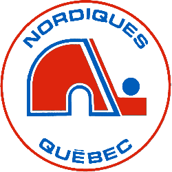
1973 - 1986
The Nordiques started out with their famous red igloo logo. The red with white and blue outline in the shape of the letter "n" and a red hockey stick is the entrance to the igloo. A blue hockey puck is on top of the hockey stick. A wordmark "NORDIQUES" on top in blue and "QUEBEC" in blue on the bottom. All enclosed in a red circle.
Unlocking the Secrets of Colorado Avalanche Logo History
Unlock the intriguing story behind the Colorado Avalanche Logo History in this captivating video! Delve into the evolution of the logo from its inception to the present day. Explore the twists and turns, surprising facts, and hidden narratives behind one of hockey's iconic symbols. Join us on this fascinating journey through time! 🏒
The Rugged Colorado Avalanche Logo
Colorado Avalanche primary logos energize hockey games with bold style. Drawing from Colorado Avalanche logo history, NHL designs ignite fan passion. Furthermore, logo PNG artwork attracts collectors with clear detail. Visit the official Colorado Avalanche Wikipedia page. Consequently, fans value Avalanche hockey heritage. They celebrate the team’s rugged primary logo identity with enthusiasm.
Sports Fan Products


