Boston Celtics
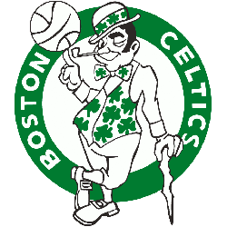
The world-famous figure has his left eye winking at you, his left hand resting on his shillelagh, his right index finger is pointing straight upward with a brown basketball sitting atop, his left foot crossed over and to the side of the right foot, he possesses a big smile (with a pipe projecting from the right corner of his mouth) and he is dressed in black buckle shoes, black pants, a gold front-button vest with a matching bow tie (with green three-leaf clovers displayed prominently in view on both), a long-sleeved white shirt and all topped off with a black derby hat with the same matching three-leaf clovers. A wordmark “BOSTON CELTICS” in white arched around the logo in a green circle.
Boston Celtics
1970 - 1997
The latest version of Boston's logo is now a one-colored green leprechaun logo, with the leprechaun traced in black and wearing only green and white clothes. He still spins a basketball on one finger and leans on a cane. The background basketball is gone, replaced with a green ring with the wordmark "BOSTON CELTICS" in white.
Boston Celtics
1967 - 1970
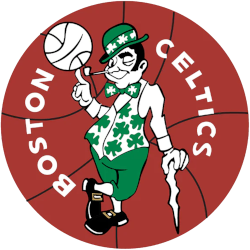
The redesigned green, white and black leprechaun in 1969 is now spinning a basketball on his finger and leaning on a cane and wearing a green Irish hat. The leprechaun is on top of a red basketball background with a black outline for a 3-D effect.
Boston Celtics
1965 - 1967
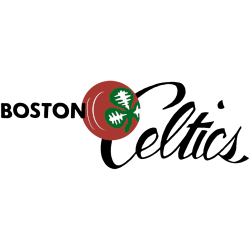
A wordmark "BOSTON" in black next to a green and white clover on a brown with white highlighted basketball and a scripted wordmark "Celtics" in black.
Boston Celtics
1951 - 1965
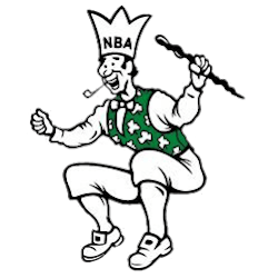
The leprechaun logo was originally designed by Zang Auerbach, the brother of Celtics head coach Red Auerbach. The crowned leprechaun is black, white, and green. He is jumping holding cane.
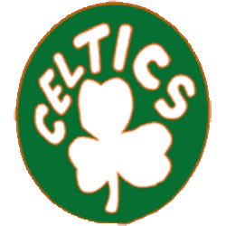
Boston Celtics
1947 - 1951
The Celtics first logo is a white shamrock with a wordmark "CELTICS" above it, wrapped in a green circle background.
Boston Celtics Logo History: Explore the Iconic Logo History in Depth
Explore a captivating journey through the rich history of the Boston Celtics Logo! From its humble beginnings to its current iconic status, delve into the evolution and significance of one of the most recognizable logos in sports history. 🍀🏀 Discover the essence of Celtics history with our Logo History collection.
Every Boston Celtics Logo in Basketball History
The Boston Celtics logo has remained mostly consistent, always reflecting Irish culture with a leprechaun mascot. However, changes in color, detail, and outline have shaped its legacy. For more logos like this, check our full NBA primary logos collection. Each version reveals the Celtics’ deep basketball heritage.
Throughout the years, the Boston Celtics logo basketball identity has been refined to match modern branding standards. You can view the official Boston Celtics logo picture and updates at the NBA’s official Celtics page. Each emblem reflects the tradition of excellence the team is known for.
Basketball Sports Fan Products


