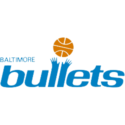
Baltimore Bullets
1971 - 1972
Wordmark“bullets” in light blue with the letters “l” forming two hands grabbing for a orange basketball. A wordmark ‘BALTIMORE” in light blue on the top and to the right of the main wordmark.
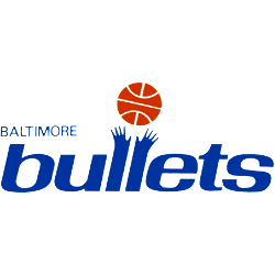
Baltimore Bullets
1970 - 1971
“bullets” wordmark in blue with the letters “l” forming two hands grabbing for a orange basketball. A wordmark ‘BALTIMORE” in blue on the top and to the right of the main wordmark.

Baltimore Bullets
1969 - 1970
“bullets” wordmark in light blue with the letters “l” forming two hands grabbing for a orange basketball. A wordmark ‘BALTIMORE” in light blue on the top and to the right of the main wordmark.
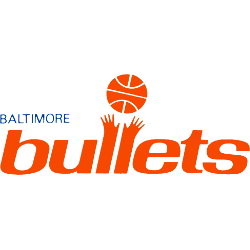
Baltimore Bullets
1968 - 1969
“bullets” wordmark in orange with the letters “l” forming two hands grabbing for a orange basketball. A wordmark ‘BALTIMORE” in blue on the top and to the right of the main wordmark.

Baltimore Bullets
1963 - 1968
Wordmark "Bullets" in red on a white with blue outline basketball with a bullet flying by in blue. A wordmark "BALTIMORE" on top in blue.
The Fire of the Baltimore Bullets Basketball Logo
Basketball Sports Fan Products