The Mighty Ducks of Anaheim logo shines in the team’s wordmark logo collection, debuting in 1993 in the NHL. Its sleek text reflects California’s bold spirit. Therefore, the Mighty Ducks Anaheim Ducks legacy captivates collectors. Moreover, the Mighty Ducks of Anaheim 1993 emblem showcases vibrant identity and regional pride.
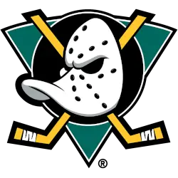
Mighty Ducks of Anaheim
2000 - 2007
A duck-billed goalie mask in white with black holes and silver highlights on a jade green with white and black trim triangle, a black with a white trim circle, and two crossed hockey sticks in gold with thicker black trim.
A thicker black outline around the hockey sticks and black trim added to the triangle.
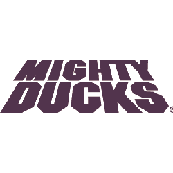
Mighty Ducks of Anaheim
1994 - 2006
Double lined wordmark "MIGHTY" on top and "DUCKS" in bold colored eggplant.
Playful Mighty Ducks of Anaheim Logo
The Mighty Ducks of Anaheim logo, a bold teal and purple “MIGHTY DUCKS” wordmark, anchors the wordmark logo collection. Launched in 1993, it honors the Mighty Ducks of Anaheim legacy. Additionally, collectors love its clean design. Thus, it complements the team’s heritage. Check the Mighty Ducks of Anaheim Primary Logo.
The Mighty Ducks of Anaheim logo ignited passion at games, tied to the 1993-2006 NHL era before rebranding to Anaheim Ducks. Its colors echo the Mighty Ducks of Anaheim jersey designs. Consequently, it links fans to California’s legacy. Furthermore, its impact endures, per the team’s Wikipedia page.

