Detroit Red Wings
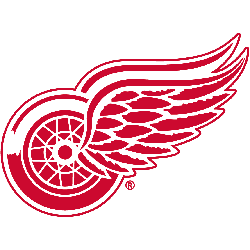
With the name Red Wings came a logo that has stood the test of time and represents a perfect fit with the Motor City. The crisp, clean, detailed, yet simple red and white look has only been modified a couple times in team history and not since 1949. The Red Wings now famous logo features a red wheel with a wing attached to it.
Red Wings Primary Logo
The Detroit Red Wings have a long and storied history, reflected in their primary logo. The original logo was introduced in 1932 when the team changed its name from the Detroit Cougars to the Red Wings. It featured two red wings with a wheel between them, representing both speed and power. This emblem remained unchanged for over 50 years until 1982 when it was redesigned slightly to include more detail on each wing and an outline of Michigan's Lower Peninsula beneath them.
In 1997, the current primary logo of a red-winged wheel encircled by 11 stars debuted during celebrations marking 75 years since the franchise began operations under its new name; this design has become one of hockey’s most iconic logos ever since then. The 11 stars represent each decade that has passed since inception while also symbolizing strength and unity among past, present & future players who wear it proudly on their jerseys every game day!
Today’s version has been tweaked slightly but remains true to form – incorporating elements such as shading around certain parts or adding subtle color variations like white accents along edges – all while maintaining its recognizable shape so fans can quickly identify members belonging to “Hockeytown USA” no matter where they go! In short: there is something special about being able to wear this classic piece of art emblazoned across your chest - which makes wearing (or even just seeing) these colors instantly evoke feelings of pride & camaraderie amongst any diehard fan base worldwide!

Detroit Red Wings
1933 - 1949
Norris and Adams took inspiration from the Montreal winged wheel logo and used their version for their newly named Red Wings team. The red logo is of an automobile wheel with two wings coming from the center of the wheel.
Detroit Falcons
1931 - 1932
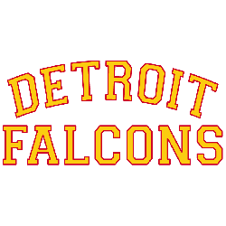
Trying to change their fortunes, the Cougars name was changed in 1930 - 1931 to the Detroit Falcons. The logo is a simple wordmark "DETROIT" arched over "FALCONS" in yellow with red trim.

Detroit Cougars
1927 - 1930
The final logo for the Detroit Cougars consists of the carrier over letter Old English white “D” now on a red shield. The letter “D” stands for the city of Detroit.

Detroit Cougars
1926 - 1927
At first, the Detroit NHL team was named the Cougars after they purchased the players of the folded Victoria Cougars team. The logo consists of an Old English red “D.” The letter “D” stands for the city of Detroit.
Sports Fan Products

Hey, Red Wings Fans - Cast Our Vote!
Click to go to NHL Logo Battle and vote
Detroit Red Wings Logo History: A Story Untold till the End!
Join us on an intriguing journey as we delve deep into the symbolism and history of the Detroit Red Wings Logo. From its inception to its hidden meanings, we uncover the secrets behind this iconic emblem. Don't miss out on this fascinating exploration!


