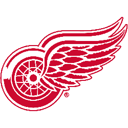
Detroit Red Wings
With the name Red Wings came a logo that has stood the test of time and represents a perfect fit with the Motor City. The crisp, clean, detailed, yet simple red and white look has only been modified a couple times in team history and not since 1949. The Red Wings now famous logo features a red wheel with a wing attached to it.
Red Wings Wordmark Logo
The first iteration of this logo appeared on jerseys during the 1932-33 season as a simple red letter “D” with wings attached to each side. This version would remain unchanged until 1948, when it was updated slightly by adding an outline around both letters and some shading within them for added depth and texture. In 1952, two more changes were made: a white circle was added behind both letters to create a rounded shape; additionally, two crossed hockey sticks were placed beneath them for further symbolism of sportsmanship between teams playing against one another on ice rinks across North America - thus creating what we now know today as "the Winged Wheel."
Modern versions feature minor alterations such as sharper edges or brighter colors. Still, it remains true to its original design from over 80 years ago - making it one of the oldest continuously used logos in professional sports and popular culture worldwide! As such, this beloved symbol serves as a reminder of Detroit's deep hockey heritage and a source of pride for all who've been lucky enough to call themselves members of the Red Wings family over the years!

Detroit Red Wings
1949 - Present
Single lined wordmark "Detroit Red Wings" in red classic script.
Font: TC Bookman Bold and ITC Bookman Bold Swash by Edward Benguiat
http://famfonts.com/detroit-red-wings/
Sports Fan Products
Detroit Red Wings Logo History: A Story Untold till the End!
Join us on an intriguing journey as we delve deep into the symbolism and history of the Detroit Red Wings Logo. From its inception to its hidden meanings, we uncover the secrets behind this iconic emblem. Don't miss out on this fascinating exploration!...