Oklahoma City Thunder
2009 - Present
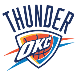
The Oklahoma City Thunder unveiled their first logo on September 3, 2008. The logo is a large blue and yellow banner with the logo in the middle with the wordmark “OKC,” and splashes of yellow at the top and reddish-orange at the bottom. On top is the wordmark “THUNDER.”
Thunder Wordmark Logo
The Oklahoma City Thunder wordmark logo has come a long way since its inception in 2008, particularly in relation to the Oklahoma City Thunder Primary logo. The original logo was designed to be an homage to the city of Oklahoma, with the colors matching those of their state flag and a silhouette of an American bison included as well. The font used for the word “Thunder” was chosen because it represented strength and power, while also being unique enough that it would stand out on any court or jersey.
Since then, there have been several changes made to make the logo even more recognizable and iconic over time. In 2011 they changed up some elements including adding lightning bolts around each letter in “Thunder” as well as making slight modifications to how thick or thin certain lines were drawn throughout each letterform which gave them more energy when seen from afar. They also updated their color palette by introducing brighter blues and oranges into the mix which helped give off even stronger vibes when people saw this brand mark on any product associated with the OKC Thunder basketball team at that time period.
Today, many people still recognize this particular design whenever they see it no matter where they are located geographically speaking due largely in part thanks to all these subtle yet effective tweaks over years combined together creating one memorable visual identity we know today - Oklahoma City Thunder's Wordmark Logo!
Oklahoma City Thunder
2009 - Present
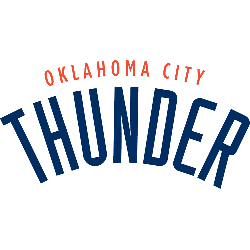
Wordmark "Oklahoma City" in orange arched above an arched wordmark "Thunder" in blue.
Font: Industria Solid
https://deltafonts.com/oklahoma-city-thunder-font/
Oklahoma City Thunder
2009 - Present
Single-line wordmark "Oklahoma City Thunder" in blue.
Font: Industria Solid
https://deltafonts.com/oklahoma-city-thunder-font/


