Washington Capitals
The “T” in Capitals forms a hockey stick that has a red puck next to it and the three stars along the top are an addition to the original look. The red, white and blue colors are representative of the capital city of the USA, it’s a wordmark of “WASHINGTON” in red and “capitals” in blue italics.

Washington Capitals
2003 - 2008
In the early 2000′s, the Washington logo changed again, though the color scheme remained the same. Out went the eagle and in came the Capitol dome. The full name “WASHINGTON CAPITALS” returned to the logo and with a puck and crossed is two sticks behind the capital dome. Two brown stars on either side of the dome.

Washington Capitals
1998 - 2003
The Capitals removed the wordmark “CAPITALS” in 1998. The same streaking eagle is flying from right to left.
Washington Capitals
1996 - 1998
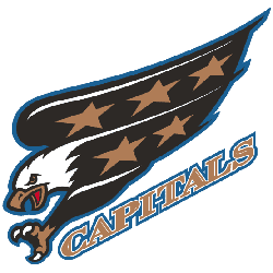
The Capitals changed their colors and logo in the mid-90s as black became popular in the NHL. At least the streaking eagle is a logo, as opposed to the wordmark that just spells out the team name. The stars made their first appearance on this logo and though the design turned away from the lettering that had preceded it, “CAPITALS” is still a prominent feature in this one.

Washington Capitals
1975 - 1996
The first Washington logo was very basic and straightforward. The slant of the blue letters goes to the left instead of the right, a wordmark “WASHINGTON" in red and "capitals" in blue, the stick is red and is the letter "t," the puck is blue and the font is more plain.
Washington Capitals Logo History: Evolution and Meaning!
In this video, we take you through the fascinating journey of the Washington Capitals logo. Discover how the logo has evolved and the stories behind each transformation from its inception to the present day. Learn about the design elements and the significance of each change, reflecting the team's identity and spirit over the years. Whether you're a die-hard Capitals fan or a lover of sports history, this video offers a detailed look at the logo's legacy. Don't miss out on this deep dive into the history of the Washington Capitals logo!
The Fierce Washington Capitals Logo
Washington Capitals primary logos energize hockey games with bold style. Washington Capitals logo history, including Washington Capitals logo eagle designs, drives fan passion. Furthermore, logo artwork attracts collectors with sharp detail. Visit the official Washington Capitals Wikipedia page. Consequently, fans value Capitals hockey heritage. They celebrate the fierce primary logo identity with enthusiasm.
Sports Fan Products
