
Washington Capitals
The “T” in Capitals forms a hockey stick that has a red puck next to it and the three stars along the top are an addition to the original look. The red, white and blue colors are representative of the capital city of the USA, it’s a wordmark of “WASHINGTON” in red and “capitals” in blue italics.
Capitals Wordmark Logo
In 2007, however, things changed drastically for this iconic emblem with a significant overhaul that brought about much-needed changes to keep up with current trends in sports logos at that time; most notably replacing navy blue from previous versions of this design with red which has become one of their primary colors ever since then. Additionally, new features such as bolder font lines were added alongside subtle details like shadowing effects to give it more depth than before while maintaining its classic look overall.
Today's version is widely accepted amongst fans all over North America who proudly wear apparel featuring this beloved symbol everywhere they go, making sure anyone around knows precisely where their loyalties lie: With The Washington Capitals!

Washington Capitals
1998 - 2007
Capitals flying eagle logo with stars and claw attaching. Wordmark CAPITALS" on a angle in brown with blue and white accents.
Font: Bodoni Poster Regular
https://deltafonts.com/washington-capitals-font/
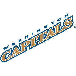
Washington Capitals
1998 - 2007
Double lined wordmark "WASHINGTON" on top in blue and "CAPITALS" in bronze with blue and white accents written diagonally.
Font: Bodoni Poster Regular
https://deltafonts.com/washington-capitals-font/

Washington Capitals
1996 - 2007
Double lined wordmark "WASHINGTON" on top in bronze and "CAPITALS" in white with bronze accent. All within a black box with blue and bronze outline.
Font: Bodoni Poster Regular
https://deltafonts.com/washington-capitals-font/


